Web designs are vulnerable to the whim of trends these days, no one questions their absurdity at the height of popularity. But eventually, you get bored and move to the next big thing, finally concluding that there’s no reason for you to be a slave to trends. We have curated the hottest UX trends for you, now it’s time to caution you about the trends that need to be avoided. Here are a few annoying trends that should straight away go to the trash.
Overdose of Parallax
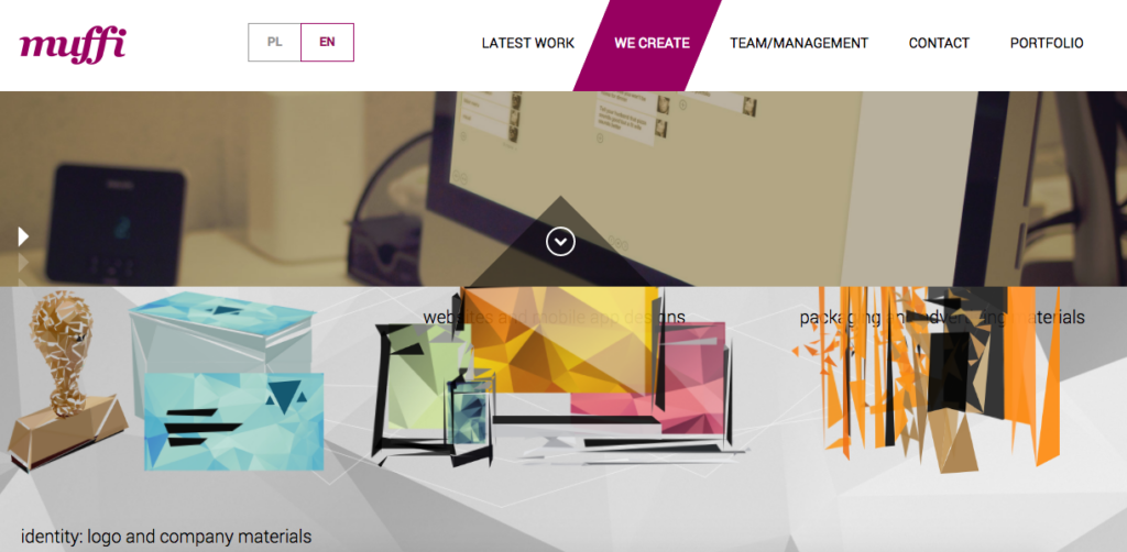
In Parallax Scrolling, the background moves slower than the foreground, creating a 3D effect. It’s a hot favorite among designers to enhance designs and add a subtle depth to the elements, but can be overwhelming if executed by amateurs.
Why avoid?
- Heavy use of graphics and javascript slows down the website.
- It’s bad for SEO as single page layout has only a little content for search engines to crawl.
- It has severe usability issues, with users complaining of motion sickness during scrolling.
Video Backgrounds
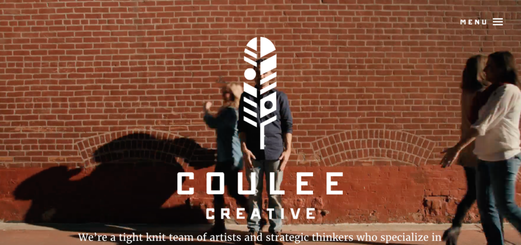
They came and conquered the home pages for a longer time. It’s a visually appealing trend with a large background video running behind the content of the web page. Video creates a very engaging experience, often showcasing the culture of the organization, storytelling their journey and products.
Why avoid?
- It affects the site load times as the extra seconds wasted during loading can deter visitors.
- Content on the top of the video background has poor visibility, and the moving visuals make it tough to read and digest.
The popularity of videos has decreased on the home page, but they are emerging as a vital part of branding. Check out in detail on our blog, Take Your Brand Viral by Creating Video Experiences.
Hiding Everything Behind Hamburger
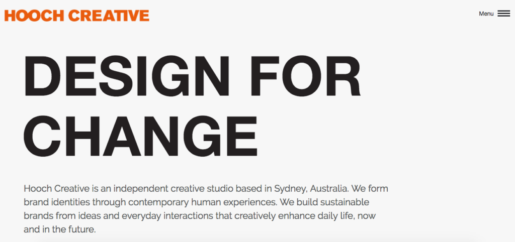
I love hamburgers, not just the irresistible juicy cheesy ones, but also the three lines hiding the entire navigation in the mobile interface. The hidden options get revealed on a single tap. Furthermore, it allows users to access a preferred item easily instead of following a certain serial order in navigation.
Why avoid?
- A clever solution that got misused in the desktop web design where hiding the navigation options is not required.
- Usability is hijacked when too many options are tucked inside the hamburger, causing confusion.
- Increases the bounce rate on landing pages.
- An improper implementation makes it hard for users to browse the website.
Learn more about some cool alternatives of Hamburger Menu on our blog, Bored with Hamburger Menu, Time to Try These Alternatives.
Boring Typography
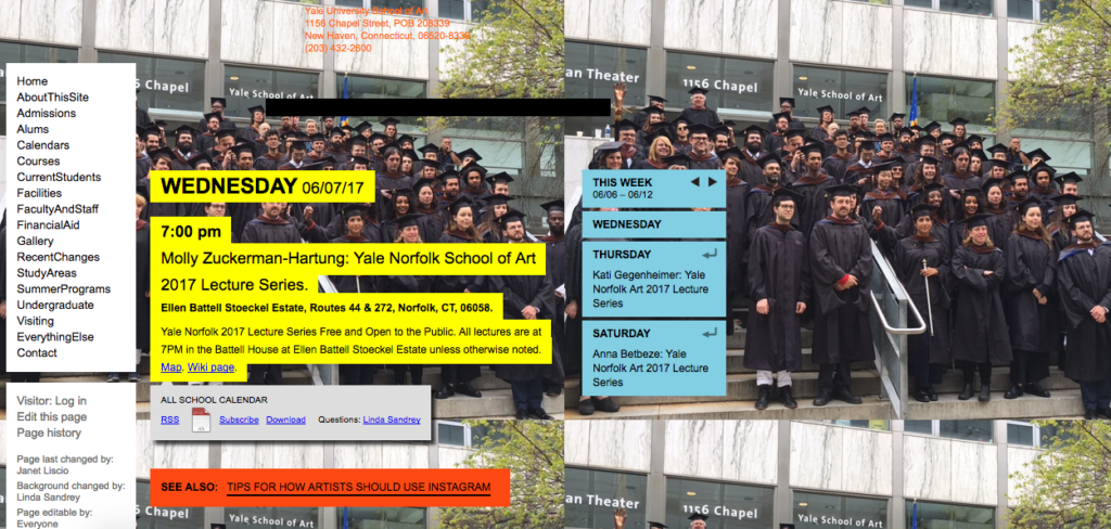
It’s not wise to use the same old typography for web pages when creative fonts are taking the branding to new heights. People are no longer are satisfied with a default available fonts and are experimenting more with custom and brand specific fonts.
Why avoid?
- Your page will depend heavily on visuals if fonts fail to create a visual impression and grab attention.
- Unlike brand specific or hand-drawn custom fonts, default fonts fail on branding and result in less number of shares.
- Going with the default font option gives an unprofessional outlook to your brand and website.
Learn more about the typography trends that will rock the web and mobile app design this year on our blog, Top TYPOGRAPHY Trends You Can’t Afford to Miss in 2017.
Image Carousels
Carousels were once an unparalleled trend, quickly embraced by most of the designers. It emerged as an easy way to pack a lot of visual information on a web page with limited space. It increases the visual appeal of the website, but it turned out to really poor on the usability front.
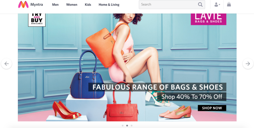
Why avoid?
- Carousels make it hard for users to find the content.
- High-resolution images slow down the loading time of the page.
- JavaScript/JQuery breaks the speed and hence lowering the performance.
- Most clicks go to the first slide, defeating the purpose of having a carousel in the first place.
- Conversions are very poor as most users find auto-rotating images distracting and confusing.
- Front page carousels are bad for SEO with no content to fetch meta tags and meta keywords for bots.
Aggressive Pop-ups
Nowadays, you can directly jump to the third page of newspapers for the latest news as the front pages are generally reserved for adverts. Same is the case with modern websites that greet you with full page pop-ups. They even insist that you confirm before canceling, while stressing that it’s your mistake and the pop-up is still lying in the tray.
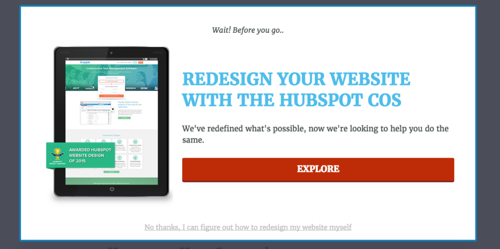
Why avoid?
- Hampers usability and if not implemented well, it can scare visitors away from the site.
- Increases the bounce rate as it gives a feeling that you don’t care about customer experience
- Diverts focus from the content, delivering something that users are not originally looking for.
Obnoxious clutter
Sidebars, floating elements, sliders, fading images/videos, and CTAs are supposed to make the user aware of the additional content offered by the site. They deliver value to the visitors and increase conversions, but overuse makes them annoying and deters users.
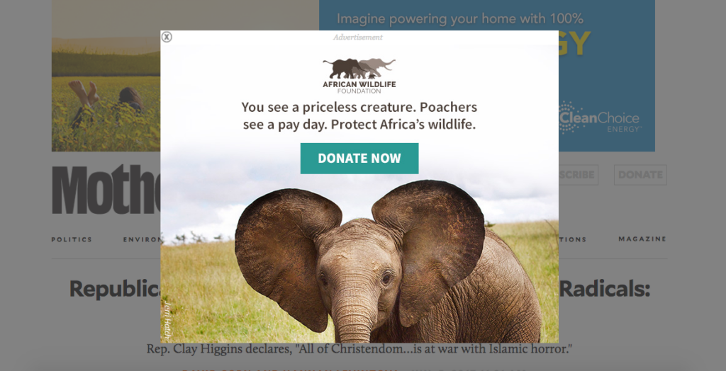
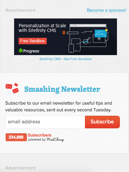
Why avoid?
- These elements distract users from the content, not allowing them to see the content completely.
- Web pages with an excess of these elements depend highly on JavaScript and take forever to load.
- Creates strain on the eyes and results in a negative user experience.
Brutalism, the ugly design
Can you actually imagine a website without visuals? The growing popularity of brutal web designs has resulted in the extremely stripped down websites. While the heavy graphics and stock photography are criticized heavily, you need them to increase the visual appeal and set the brand apart.
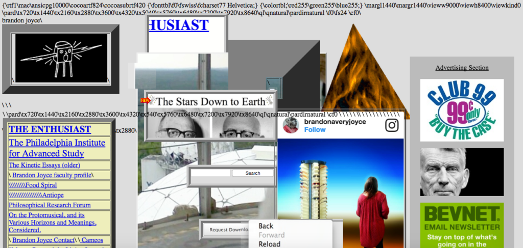
Why avoid?
- Resulting in sites where it’s difficult to figure out the buttons and interactive elements.
- No brand identity or individuality in the web design.
- Contrary to the popular opinion, these tidy and clean websites are mostly very difficult to use.
While brutalism is gaining limelight of late, it should not be confused with the simplicity of minimalism. Learn more about minimalism on our blog, Japanese Culture and Minimalist Designs Both Start with Simplicity.
Annoying needs to go
There are some more trends that have been getting panned by critics since long, for example, FORMS lacking LABELS, then there are ONE PAGE designs squeezing most of the content above the fold fearing users won’t scroll or the BLUR and SCALE effect where the page content is almost immediately clear, but the background image is a blur.
Things change faster in the world of UX design. Some of these trends are pretty popular, but bad for your user experience and may be worse for your business. Drop us a line and let’s analyze a new trend together for viability before implementing it blindly.
