Technologies appear and disappear very quickly in the dynamic space of WEB. While facing a blizzard of upcoming web design trends, it’s quite possible to miss the continuously evolving typography styles. However, a design expert couldn’t afford to ignore the fundamentals and future of typography. To make things easy for you, we have curated a list of typography trends that have been gaining popularity over the last few years. These trends are expected to be embraced more widely in the website and mobile app design in 2017 as well.
Brand specific typography, #Custom
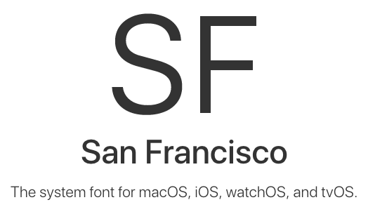
Bookerly, San Francisco, Product Sans… well that’s only a few from the long list of brand specific custom typefaces. The eCommerce big daddy, Amazon introduced Bookerly, a serif typeface designed by Dalton Magg for Kindle. The Cupertino giant followed soon by debuting the San Francisco typeface with the Apple Watch and then made it a norm across MacOS, iOS, watchOS, and tvOS devices. The tech giants are not the only ones experimenting with custom fonts. Unity, a custom typeface for Hillary Clinton and BF Tiny Hand, a fun font aping Donald Trump handwriting made an appearance during the US election.
Furthermore, making custom typefaces has also become easier with tools such as Prototypo and FontArk. Custom typefaces create the same effect as a creative type and strengthen the brand identity. It’s also a perfect way to set your brand apart from others and achieving a brand likeability with consumers.
Perfect fit for all your devices, #Responsive
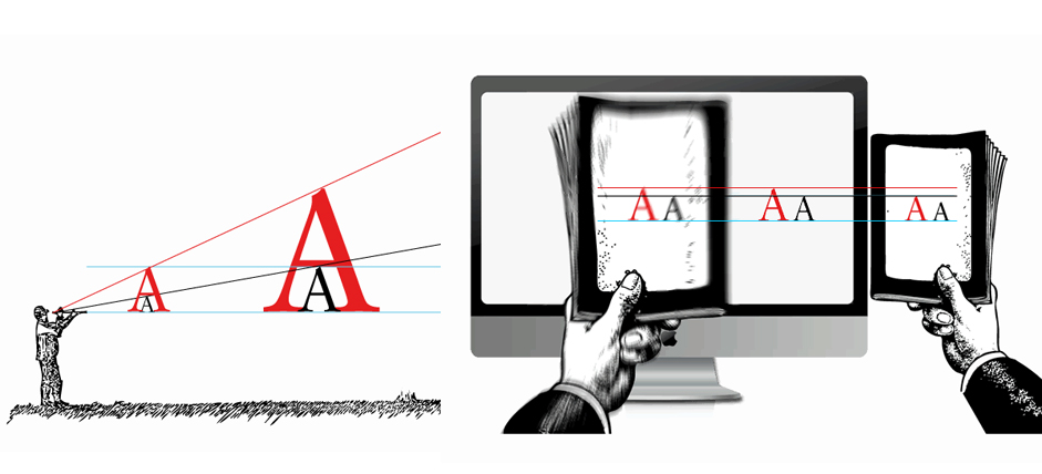
There are so many new devices popping out daily and therefore we need a type that can adapt with devices.In a desktop screen, oversized headings can create drama but it will break continuity and force excessive scrolling on a mobile screen. Therefore, the typeface should be able to shrink and grow depending on the size dimensions of diverse devices such as smartphones, tablets, laptops etc.
In responsive typography, the font size, spacing, and layout together create an aesthetic text setting for each viewport. It uses style variations, indent paragraphs, and whitespaces to separate sections. You can even optimize line heights and line spacing to ensure higher readability across different devices and viewports.
Go extreme with size, #Oversize
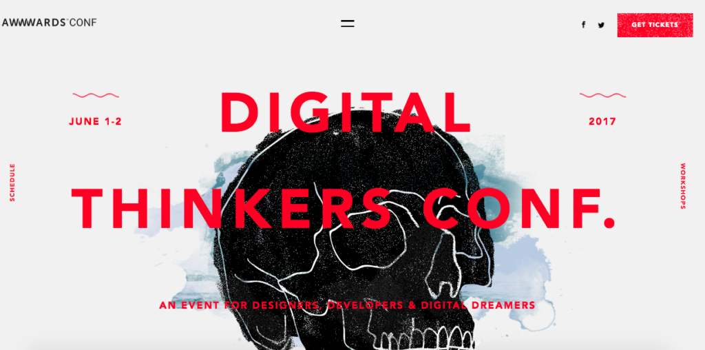
Text size can help you bring drama to your design and influence user opinion at the same time. While an oversized typeface helps you deliver a powerful message, smaller texts can set the focus on the product. The big font size is eye-catching and increases accessibility in designs. Smaller fonts, on the other hand, stand out on a minimalist background or a hero image so that the focus is more on the image than the content. Smaller type uses thick strokes, high contrast colors, and negative space to create intrigue.
The current trend in design is to go either tiny or oversized, the midway is fizzling out slowly. The decision to go for smaller or large fonts mainly depends on your brand image. However, the technique is to start with the most extreme size, either too small or too big and then reduce or increase the size that delivers the message without being too revolting.
Add a tinge of personalization, #Unique
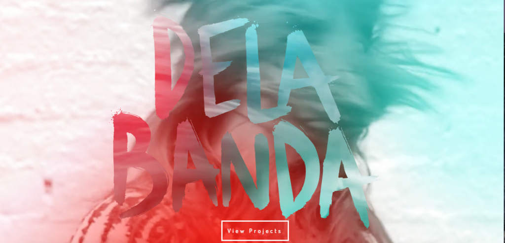
Art, in its deepest form, is an expression and provoke thoughts. Artistic typefaces are the most innovative and fresh way to bring out a brand identity. This year, we are going to see increased adaptation of artistic fonts that bring out the personalization in design.
Watercolor typefaces impart a fun loving and joyful attitude to web pages.
Handwritten fonts are emerging as a powerful trend, giving an authenticity and personal touch to the brands. While some fonts are really hand drawn, some are stock fonts modified to look hand drawn.
Alternative music movement is the inspiration behind the rough and unique Grunge typeface, where each letter has different specifics and gives an impression of being created manually by an artist.
Retro or vintage fonts are also making a comeback with a modern makeover, emerging as another popular trend to bring classiness and sophistication to the design.
While ALL CAPS typefaces come across as imposing, it delivers the message loud and clear. While it’s easy to go overboard with all caps, but if blended with other artistic fonts, it can result in a bold yet lively design.
The future of typography, #Variable
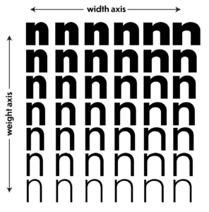

Here comes a style that is going to stay for a longer time. Microsoft, Google, Apple, and Adobe jointly unveiled the OpenType variable font project in September 2016. Termed the future of responsive design, here a single font file acts like multiple fonts. So instead of downloading multiple files, a single OpenType font file specification will enable designers to play with different aspects of multiple fonts, such as position, height or weight to create one complete font.
I am in love with the shape of you, #Geometric
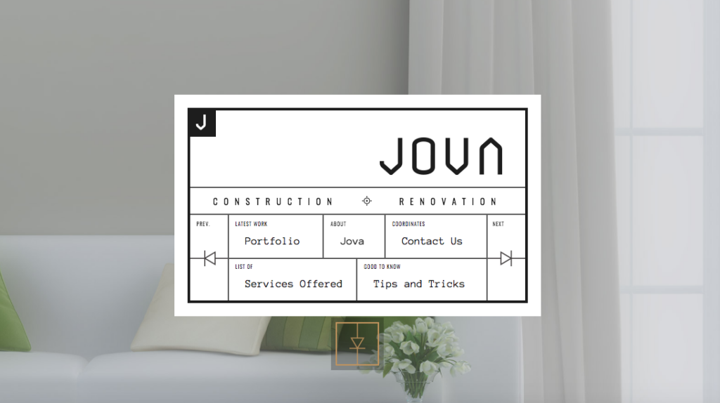
Our life is full of geometric shapes and it inspired a typography style that consists of straight monolinear clear lines or circular and square shapes. It looks elegant, smooth, and eye-catching and leaves a modern impression on the audience. There are many geometric fonts on the rise in 2016 and much more will follow in this year too especially a cube inspired typeface. Geometric fonts are adapted by companies to impart a professional and trustworthy image to their brand.
Photo and text, #Overlays
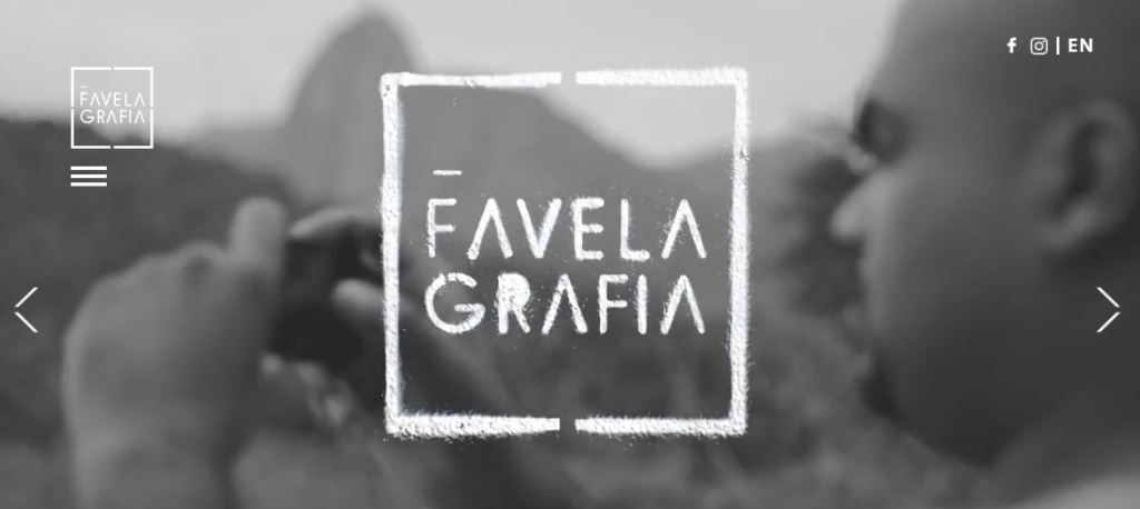
Images and text are two of the most popular entities of the web design and their combination helps in delivering the right and powerful message. However, while putting text on the image, it’s important to tune contrast to make sure that the text is visible and not disturbing the focal points of the image like faces or product images. The image and text together shouldn’t confuse the audience and impart the same meaning.
Mix and match your types, #Combos
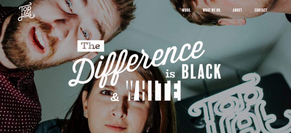
The trend which is picking pace in 2016, and will definitely see wider adaptation is of mixing and matching typefaces. This is not limited to just different sizes of the same typeface but also using multiple typefaces that go well together without disturbing the consistency in design. Bringing different styles of typography leads to better visuals. Paying attention to textures, patterns, and artwork can result in an effective and modern web design.
The closing
Stock images are something you can’t avoid, but typography is something that gives a brand an opportunity to stand out. Some of these trends are already widespread and a few are pretty new but crucial enough for you to stay ahead of the curve. Improving your arsenal with new trends while designing interfaces and interactions is the only way to make habit-forming products. Drop us a line if you need help in adapting these new typographies in your project.
