
Crazy crowds, chaos, and traffic, that’s how we describe a regular day in Bangalore. Our life has become really chaotic and a day out in the realm of jungle brings calmness back to our life. In the same way, it’s normal to be tempted to create flashy designs laden with features, but that’s chaotic like Bangalore 😉 However, a minimalist design is like that peaceful walk in the jungle, bringing real excitement and conveying the most intricate features without cloaking behind the decoration.
What makes simplicity so attractive?
Minimalism is the hottest property in the web world of late. It’s not about creating a simple website, stripped with all features and only white space left, but creating a clean, friendly and fun design. Users are most attracted to sites that are simple yet user-friendly. A design with no bells and whistles to accentuate the necessary elements, minimalism offers higher user engagement, usability, and aesthetic appeal.
How minimalistic design evolved?
Minimalism was an integral part of Japanese culture, whether it’s their architecture, interiors or even their manners. Subtle color choices in design favoring balance and simplicity, and to keep the spotlight always on functionality.
The idea of minimalism extended to painting, music and arts, and finally found a foothold in consumer products, chucking the excessive ornamentation and elements that didn’t contribute to the design in a significant manner.
What makes minimalism?
Minimalism is nothing but applying less is more principle to simplify the complexity in web design, by not letting animations and flash bumping off the user experience from design. There are three main components:
Whitespace
So you think, there’s nothing in whitespace. Think again, as in minimalism whitespace or the empty space between visual elements is used to add more emphasis to the existing elements. It eliminates anything that conflicts with the product’s goal so that users will not find anything stressful on the site and in turn find the experience engaging.

However, the catch here is to not remove so much that users have to break their head for the features they need, defeating the original purpose of minimalism to make it easy for them. It’s not only about the white space, some sites use the colored background to energize empty space.
Contrast

With no flashy stuff allowed, how to bring excitement, drama and interest in your minimalist designs. Contrast comes to your rescue here. You can use high contrast palette to give a fresh, modern look when there are less visual elements on the page. It can help you make your site more readable and will guide users towards most important information or actions. The goal of contrast in minimalistic designs is to increase efficiency and ease of use.
Typography
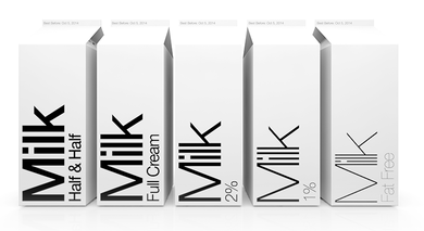
If you feel that design is all about colors and shapes, you’ve got it all wrong, design also needs words for chatting up space. Especially in minimalism, where you have absolutely nothing fancy to attract user’s attention. You can go for dramatic typography, however, excessive usage of ornate fonts will defeat the purpose. Your choice of fonts should complement the content so that the right message or action is delivered.
Less is more
Simplicity is not just about the design, but the overall experience a user will have while interacting with the site. It’s about helping the user to accomplish the site goals and should not feel any distraction or confusion while performing the tasks. The task completion should blend smoothly into the user’s experience. You can even try to simplify the design by cutting down on the unnecessary decorative elements such as animations, flash etc.
Minimalism is all about making the design elements relevant by reducing them to a minimum, necessary to function features, a simple straightforward typography and a bare use of colors.
Image Source 1 | Image Source 2 | Image Source 3 |