
Some time back, Hamburger menu used to bring freshness to the mobile navigation. It became part and parcel of all top apps, and people even started using it liberally on the websites. But then, the over popularity landed it to places where it wasn’t required and not recommended. The over usage was panned by critics and suddenly everyone’s favorite hamburger is labeled a delinquent.
Let us throw more light on Hamburger menu, why this navigation is so popular and some alternatives that can give hamburger a run for your money.
History of magical three lines
Hamburger menu’s history goes back to 1981, when Xerox product designer, Norm Cox created hamburger icon to indicate a list within Xerox Star system. Its presence was limited to a few appearances for a while until the advent of smartphones. The need to fit the complex desktop navigation into small screens pushed hamburger into the mainstream. The entire navigation hidden behind the three lines hamburger icon, which is shaped like a thin piece of meat lying between the two pieces of bread.
Why hamburger gained popularity?
Hamburger menu has long become one of the most popular design elements for smartphones. The hidden options get revealed on a single tap and allow users to access a preferred item easily instead of following a certain serial order in navigation.
Moreover, surplus options lead to chaos and a delay in decision making. The navigation options neatly tucked behind the hamburger icon, make the interface looks clean without the clutter of drop-downs, search bars, social media icons, and much more to distract users.
There are reasons why hamburger menu is a must, but here are some alternatives that are worth a try.
Tabs
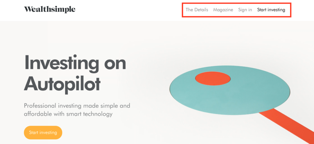
Tabbed navigation is the most uncomplicated navigation pattern. It’s ideal when you have a limited number of sections on your website, preferably five or less. It’s always wise to give a logical progression to the tabs, where the first tab should be the home tab. You can highlight the active tab so that there is a visual distinction between different tabs.
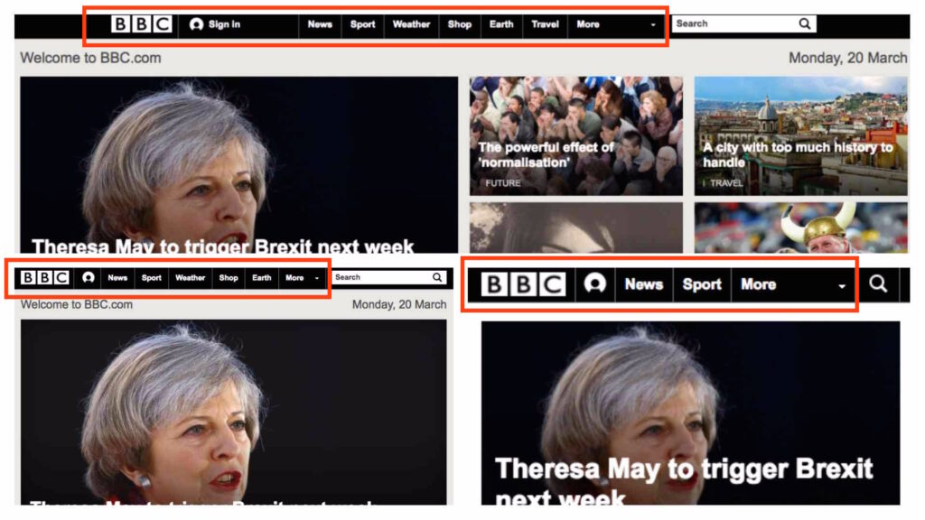
Tabs + more

When you have more than 5 sections, you can display the four top sections in the navigation bar and label the fifth element as ‘More’. It can either open a drop down displaying the remaining options or a navigation drawer. This arrangement is better than the hamburger menu as the frequently used options are always visible.
Progressively collapsing navigation
A better alternative to Tabs+more navigation is designing a menu that adapts to the width of the screen. This displays the maximum number of navigation options that can fit in a particular device. The remaining options are placed comfortably in the More section, when there’s not enough space.
Scrollable navigation
This navigation comes handy when it’s difficult to prioritize the menu options or to hide the options under the More umbrella. In this case, you can list all the items in a scrollable view, but there’s a catch here. As only a few items are visible, designers have to leave visual hints in the interface to suggest users that horizontal scrolling will reveal more elements. Moreover, your user should be willing to explore through scrolling.
Dropdown menu
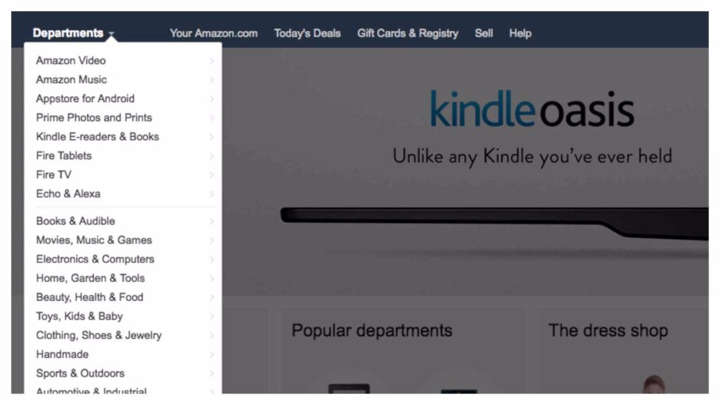
When there are a lot of sections with each holding equal importance and the visibility is not essential, then it’s wise to tuck them under a drop down menu. The label of the drop down menu serves as the page title and a downward arrow displays the remaining sections. The list contains items that are similar to the main section and/or one of its subsidiaries.
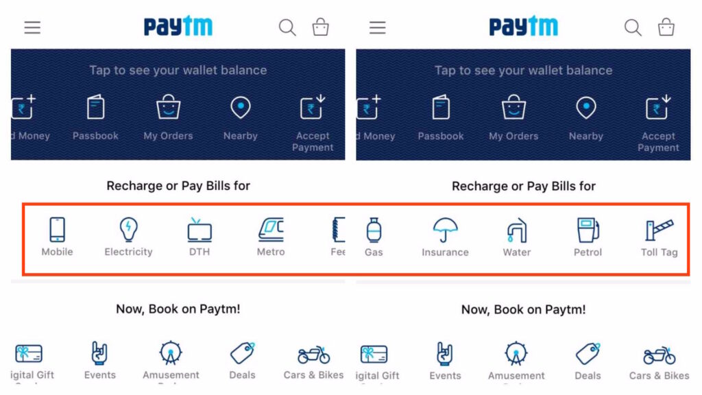
Bottom navigation
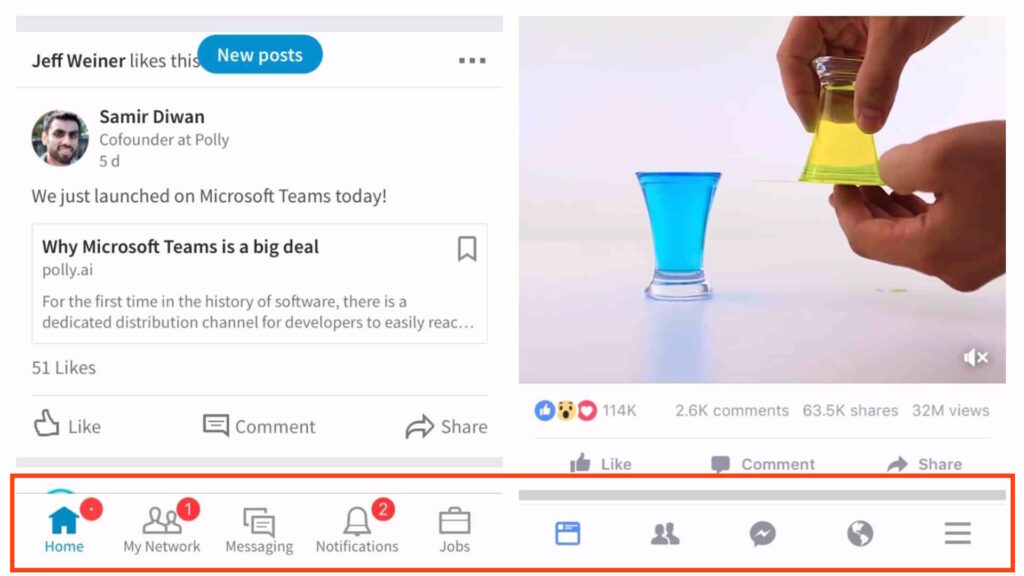
Very similar to tabbed navigation, but the top sections are shifted to the bottom bar in this navigation. The navigation bar could be sticky or hidden and revealed during downward and upward scrolling. There are two ways of putting the bottom navigation, the pattern could be icons with or without labels.
Vertical lettering

It’s one of the emerging trends and stands apart from the usual horizontal oriented content. It takes very less space and a narrow line can fit all the sections. It’s considered to be a very chic but not a straightforward navigation. Therefore, create a dedicated navigation bar as it’s not easy to spot if merged with the background. Another version of it is gaining popularity where the menu is scattered across the perimeter of the interface.
Still in Love with Hamburgers
If you still want the goodness of hamburger in your design, you can give a shot to floating hamburger menu. Instead of the regular button tucked in the side, you can create a floating action button that’s well within the reach even in big screen smartphones. The floating button is great for grabbing attention and at the same time saves space.
Hamburger menu indicates that there are elements within your reach that can further enhance your experience without hindering your current experience. Hamburger menu like any other UI element has to be used with precision. Its misuse could be life threatening to the user experience. It’s important to distinguish between the functionality or features that need to be always present on the page as packing frequently used features to a hamburger is not a great idea.
Wondering if hamburger navigation is ideal for your product, let’s brainstorm with INKONIQ.