In modern times, almost all print publications have moved to digital realm as readers are using multiple devices and platforms to consume content. However, old school way of replicating print content into digital is the not the way for media houses to stay relevant. Flipboard, InShorts and many other players are already disrupting the traditional media by innovating the way content is delivered. Millions of VC dollars are a proof of their success.
Therefore along with crafting great content, traditional media also need a design revamp to face the might of these emerging players. They have to delve deeper into the latest design trends in the online magazine to shape up their future strategy. Look nowhere else, you can kickstart with our favorites.
Hey! I am the FEATURED Post
Magazine interface couldn’t afford to have a simple blog layout, a prominent featured posts widget can help them differentiate. It could be either in the form of a fixed grid or a huge carousel auto-rotating to display a series of blog posts.
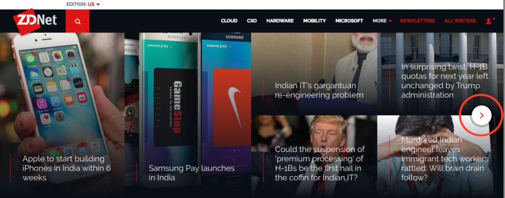
ZDNet opted for an interesting mix of both grid and carousel, and blend of large and small thumbnails for the posts.
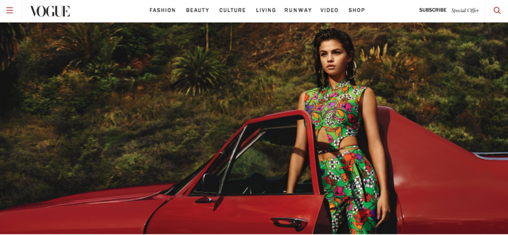
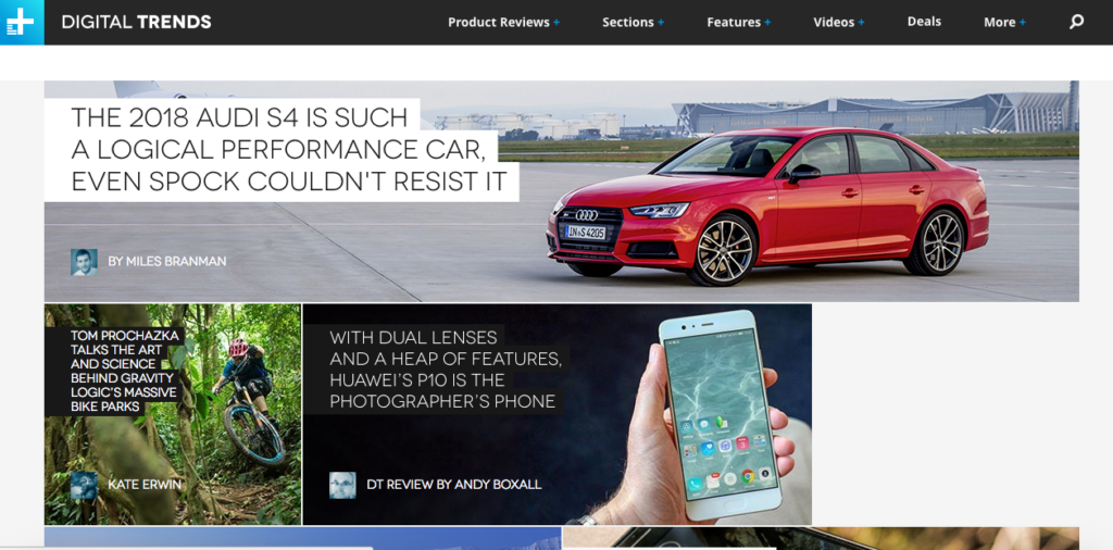
There are more variations of this grid. In Vogue, a featured story widget fills the entire screen with a supersized image to draw the maximum attention. You could also give a mix of different size thumbnails to give a professional look to the magazine as in the case of Digital Trends. However, when you want to give multiple stories the same leverage on the screen, choose active carousels to automatically display multiple posts. However, carousels are not highly recommended for usability.
VIDEOS, now part of your regular news feed
Video consumption is at all-time high now. Videos have long been known to create maximum impact on fans. Not only they increase the level of engagement, they are also shared a lot on social sharing sites. Even the new Facebook timelines support videos. Moreover, users are now consuming media more on their mobile devices and prefer watching their news instead of reading them.
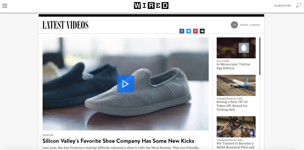
In Wired, videos have a crucial place in the homepage design, with many other leading online magazines following too.
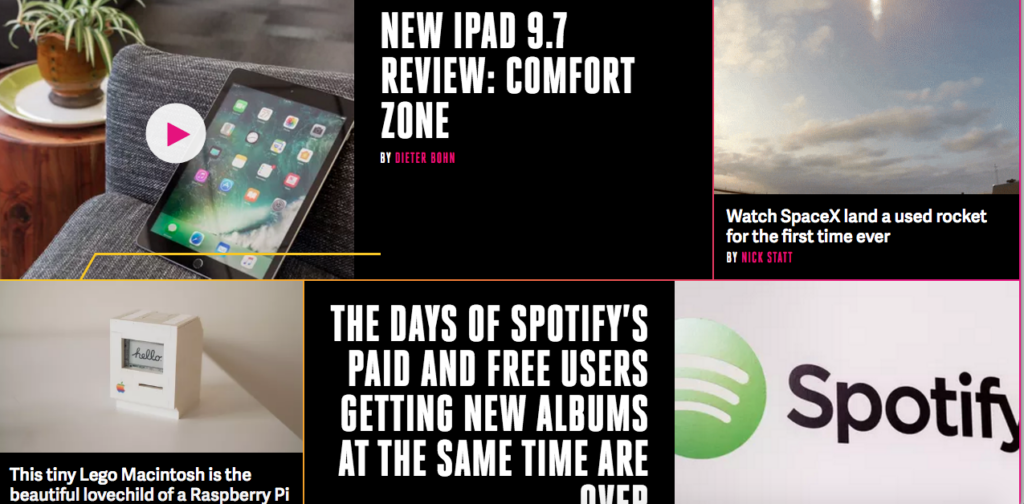
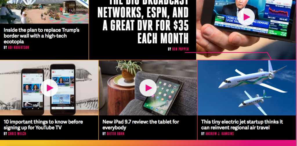
Furthermore, reviews and ratings are often captured well by videos. On the Verge homepage, review videos and interesting footages aesthetically occupy the featured story grids. Furthermore, you can watch video right from the thumbnail by clicking the Play button. Videos are sandwiched between the articles on the newsfeed as well. The best part is that the videos don’t auto-play on the feed and users can play it when they like it.
Tag along TAGLINES with titles
InShorts has started a trend of delivering news in 60 words and they got pretty much successful in that. Magazines also replicating this trend, writing headlines with a tagline to give away extra information about the story. Taglines are great as they give people a chance to skim through the main details and decide if they want to read further. This trend is finding more acceptance with Mashable and TheNextWeb (TNW) supporting taglines for their stories.
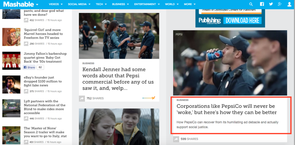
Another interesting trend that is picking up is to showcase titles on image tiles and taglines on mouseover. The tagline should not overpower the titles and therefore a color contrast or a different font size draw visitors to headline first and then sequentially guides them to the tagline. Wired utilizes contrast while TNW and Verge use gradient to highlight the blog titles on the image.
Watch your TYPE!
Attractive titles, catchy subheadings, and beautiful imagery are important, but typefaces are equally crucial in affecting the way people read it. The font size, line length, and line spacing affect the readability of the interface. The font you choose also plays an important role with brain processing information better if an easy-to-read font is chosen. However, creative fonts come across as personal and make the message more impactful.
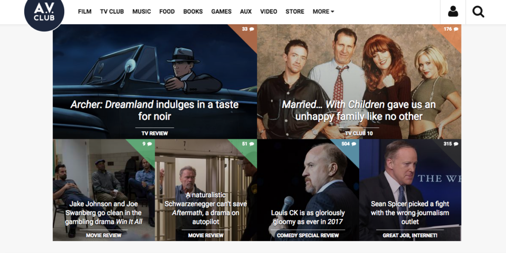
Online magazine blogs are seeing more acceptance of creative handwritten font. This is like choosing the best of the worlds, taking a clear font and interspersing it with a creative font to craft creative handwritten fonts. Experimenting with fonts gave a fresher outlook to the AV Club Magazine, and increased readability at the same time. Verge earned a very loyal reader base in a very short span of time, by using supersized fonts for blog titles.
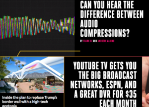
Honey! I have SIMILAR content for you
Online magazine is not about one or two posts but hundreds or even thousands of stories. This even includes following a particular story for days. Old related stories are often referenced in the blog, but it’s not recommended to clutter the blog with too many links. The best way to feature similar stories is by introducing a related posts section. This works effectively engage readers to browse within the site.
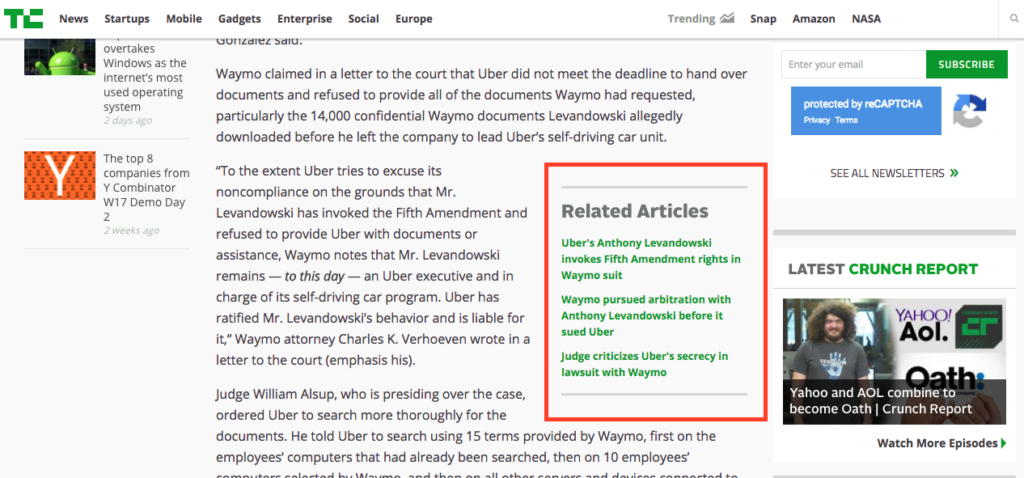
There are many ways of showcasing related content. In Inkoniq blog, we prefer to display thumbnails of old posts at the bottom of each post. You can do a TechCrunch by directly adding related content links into the content. You can even add a sidebar showcasing a bunch of similar articles on the same topic. The sidebar could also feature a bunch of posts from a large series of projects relevant to that particular topic.
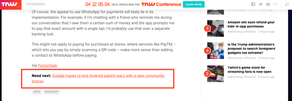
If you don’t have multiple links about the same topic, you could do some internal linking like TNW and Mashable. They even highlight the text by using a different color or font types or size.
FIX that scrolling sidebars
Online magazines have a fairly common trend of a navigation bar fixed with the main content of the post. The title of the post is also pinned to the navigation bar. However, a new trend is picking up of a sidebar that’s fixed even when you are scrolling the main content. So, a short snippet of content is fixed on the side of the article even when the reader scrolls down.
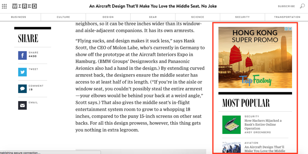
In long form content, sidebars go out of sight very quickly and a fixed sidebar is perfect as it will be in view at all times. Wired features advertisements, free giveaways, related and most popular content on the fixed scrolling sidebars. This increases the interactivity and also the number of eBooks downloads, seminar registrations, email subscriptions, and ad clicks.
I want everything, let’s CUSTOM made homepage
In contrast to a typical blog design with thumbnails for posts, another trend of designing custom homepage layouts is emerging. These homepages have columns changing based on the page layout. It’s a trend often seen in magazines with numerous posts.
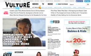
Vulture Magazine features multiple columns, a horizontal column featuring the latest blog posts, a featured post widget, a vertical column displaying the blog feeds based on timelines and many more sections below. Custom blog pages also feature multiple sections showcasing social feeds in a linear fashion.
Closing
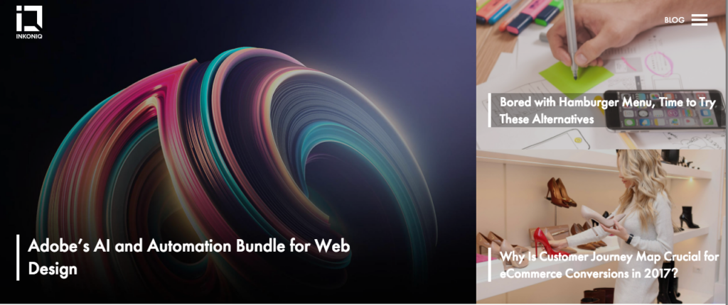
In Inkoniq blog, we chose grid format for featured stories. It has a large image for the most recent blog, chaperoned by side thumbnails for the latest blogs.
It’s completely fine with bloggers opting for a simple layout for their personal blogs. However, online magazine blogs couldn’t afford to carry on with the same traditional format. World class publications are expected to provide exceptional content and a design layout that brings justice to the content. We do understand that it’s difficult to pick the best layout for your business, you need a professional help from a reputed agency. Drop us a line and let our experts design an ideal magazine layout for your business.
