If you combine the basics of human psychology and UX design, one of the users’ most basic requirements out of an interface is that it should be functional to complete their requirement. The next comes usability, so it should be easy to use and remember, and DELIGHT comes at the top of the ladder, that’s where the connection happens when the interface is able to emote, empathize, and connect with real humans.
While creating delight is an essential part of any UX process, it’s not given its proper due while crafting the business strategies. Yes, it’s easy to ignore the benefits of delight over busy timelines, budgets, and complex business goals. But if implemented well, it can bring stickiness to the product, evoking a positive emotion in the users. Here’s how you can create a delightful experience for your users.
#1 Beautiful and usable interface
The most obvious way to delight your users is to build an interface that works properly and looks great. It has a huge impact on how your audience perceives your product. You should refrain from confusing your users by introducing a complex feature that has a huge learning curve. Reusing common design patterns and consistency across your pages help in creating an interface that’s easy to use. For example, you design call-to-action buttons of similar color and place them at same locations to build familiarity with the interface.
#2 Seamless User flow
Everyone needs to follow a series of steps to complete a task, however, the tedious steps and obstacles often lead to dropouts before the task is done. Therefore, it’s necessary that the navigation flow should be engaging and frictionless. Reducing the pain points or roadblocks will achieve a feeling where the user gets absorbed into completing a task. It’s about finding places where a user might feel anxiety or will be emotionally vulnerable. You should be providing elements in these places that assist and help them continue. The design flow should be so easy to interact without any explanation.
#3 Surprise

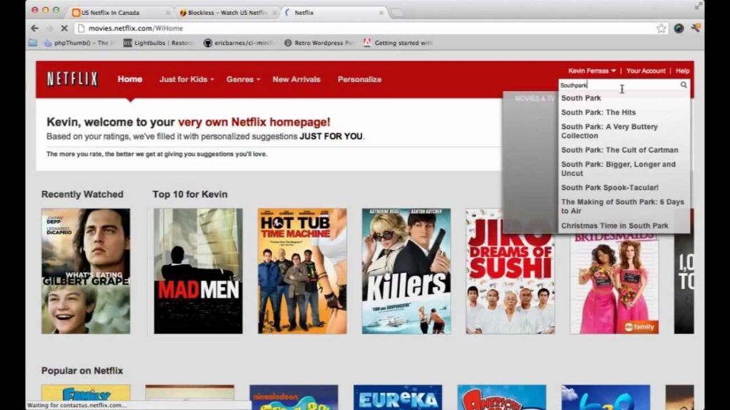
Why has Netflix become so popular? The way it makes sense of the consumer patterns and surprises viewers with their chance favorites unexpectedly. Surprise is the best way to delight users, a well-placed text can change a dull moment to an interesting one, or an animation can cover up for long loading time or interesting label text can engage the user to fill a boring form. At times, it also provides a break and motivates user to continue exploring the interface.
#4 Microcopy
Website microcopy can be anything right from a success message, loading screen, onboarding screens, error message, examples, placeholder text and labels or buttons. But these text help users to complete their journey and sometimes delight them. Overall, they help in enhancing the user experience. It also helps in breaking down the barriers and turns a mundane task into an interesting one, helping users to trust the interface.
#5 Animations

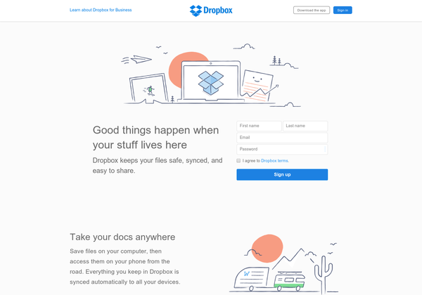
Animations are more interactive than a static image and less space heavy than a video. Simple, fast and meaningful animations can not only add delight but also provide assistance to users to accomplish practical tasks. They also make interactions engaging and fun. Dropbox has used animation in the most interactive way to train users on how a product works. Animations should have a purpose and helps users to complete a goal. However, try to introduce only simple animations as the sudden movement can make users feel dizzy or overwhelmed.
#6 Personalization
Advanced features, interesting animations, flashy transitions, everything has its own benefits. However, there’s nothing compared to an interface that adapts to its users’ preferences. It’s easy to create a WOW factor via an interface that knows its users. Ecommerce giants are offering recommendations based on the browsing and purchase history of users. Remembering users preferences and where they left in their last session help users to feel that UX is custom made for them. Reminding them of where they dropped out and the reason also increase engagement and user loyalty.
#7 Conversational

It’s important that the interface speaks with an individual. Whether it’s imagery or text or colors, it should have the same personality as the rest of your brand. But the conversation is not limited to sticking to brand elements, but providing assistance that helps users in achieving goals. The visual interface is definitely appealing, but a range of text or audio based interactions are more engaging. Conversation opportunity offered by brands gives a better understanding of human interactions and emotions. You can even include chatbots to imitate a feeling of human interaction for delighting users.
Delightful UX can make your product big
When people talk about your product with delight, it automatically increases not just their engagement but also loyalty. However, the main goal of delight is to evoke a positive emotion in the user, encouraging them to share their experience with other folks resulting in the free word of mouth and more people talking positively about your product. But for delight to work, your website should also load quickly, should be able to solve the real human problems and should be beautiful enough to attract the right audience. Let’s connect to build a delightful experience for your users.
