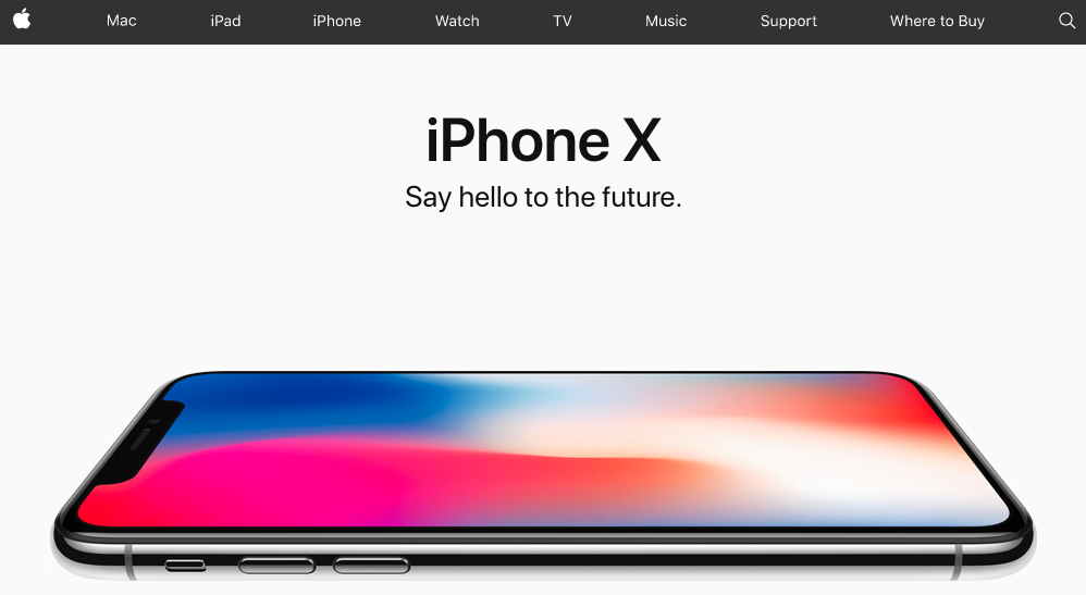
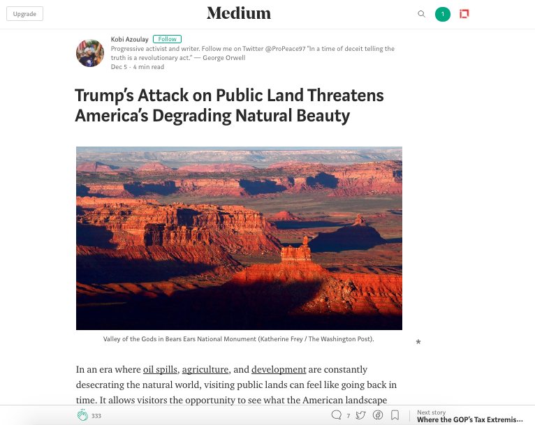
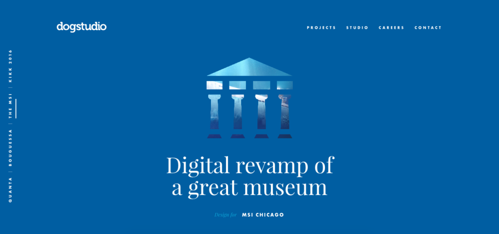
Negative or White space may be an unused area around the object for some, but in reality, it’s a way to enhance the elegance of the design elements, a necessary pause in the clutter. Why Designers think White space is as crucial as content in any design, let’s explore.
What’s important and what’s not?
White space can be used to communicate to your users on what is important and where to look next. It creates a path for the eye to navigate smoothly through the content. Negative space around the element ensures that the particular element stands out more and demands attention. You can give extra padding around the segment of content to force their attention to a particular area as there’s nothing else around the element to distract attention.

Creating a flow or visual hierarchy
White space is crucial in creating a path for the eye to navigate smoothly through the content. It creates a balance between elements, communicating the intent of the design and how the user should flow within the page. Space allows the user to concentrate more. It’s an ideal scenario for the call to action buttons to draw the maximum attention. It can be used to guide users through the site and help them reach their goal effectively.

White space for readability
The mobile-savvy audience gets overwhelmed with the cluttered page. White space reduces the clutter and improves text readability. White space between paragraphs and in left and right margins can increase the text comprehension up to 20%. Even, line spacing plays a huge role in optimizing the text content. The breathable space between the content makes it digestible for the audience. However, it’s important to bring the right balance, too much space brings a disconnection between the content.

Establishing Relationship between UI elements
Unorganized information bound to confuse the user as the human mind organizes information with a VISUAL HIERARCHY. White space plays a huge role in establishing a relationship between different UI elements and content. According to the Law of Proximity in the Gestalt theory of visual perception, the objects that are in close proximity will appear as a single unit. So the amount of White space controls if the elements are grouped together or they should be perceived as different units.

Not a waste space but a genius tool
White space is a powerful design element as important as the image, text or any other UI element. There’s a lot of effort required to figure out how much space is required to build a good layout. Good UI designers consider Negative space as a valuable element of screen estate and incorporate it in all page elements. The minimalist designs have abundant White space in the designs, but it’s up to designers to intelligently employ it to draw the spotlight on the content.
If you want to explore the right usage of white space in your design, give us a shout.
