The Gaming community is growing like the Pacific Ocean and we are a few crazy drops of it and these gaming apps are insanely addictive, hard to break away, once you start playing. This doesn’t apply to just kids, even adults are obsessed and this obsession is spinning millions of dollars for app makers. Look at Angry birds, Rovio is making money through everything, unveiling versions of the original game and licensing deals of every household items from cute fluffy soft toys to even t-shirts to even the recently released Angry Birds movie.
I’m sure many of us are planning to build similar crazy games that can pour more money into our bank accounts, but is the flashy interface good enough? The answer is ‘NO’, an intelligent user experience is the way to build the stickiness in your games that make your users come and play them again and again. Now, it comes down to HOW? What are the components we’ve to keep in mind while building one of these, let’s connect the dots?
Learning game like a pro

Angry Birds give new users a walkthrough of Birds village, interactive video of how dirty pigs stole eggs, and how Red and his friends bombarded piggy people’s home, all to keep the interest going right from the start. Familiarizing users with the game is a crucial step of user onboarding process. It contributes towards retaining acquired users.
You can run a tutorial in the background to enlighten players about the game while their information is retained through signups. But remember that long and tedious signup forms are so boring and players clearly didn’t come to your app for filling those.
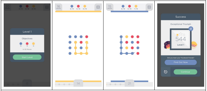
Another better way to introduce your app to the players is guiding the player about the basics of the game through an interactive animation design. An additional advice or a prompt should be presented to the player wherever they face a new challenge. Two Dots, a puzzle game, has devised a similar strategy wherein the player acquaints himself with the nitty gritty features of the game at the start.

You can also reward your players with an option to add facebook details in order to compete with their friends. This is a very clever strategy to engage your user when given a competitive yet fun-filled opportunity to play the game further.
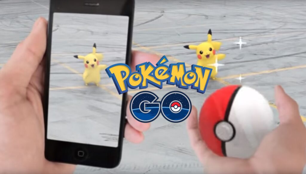
Or you can do away with the tutorial, like Pokemon Go, where users learn things while playing real time.
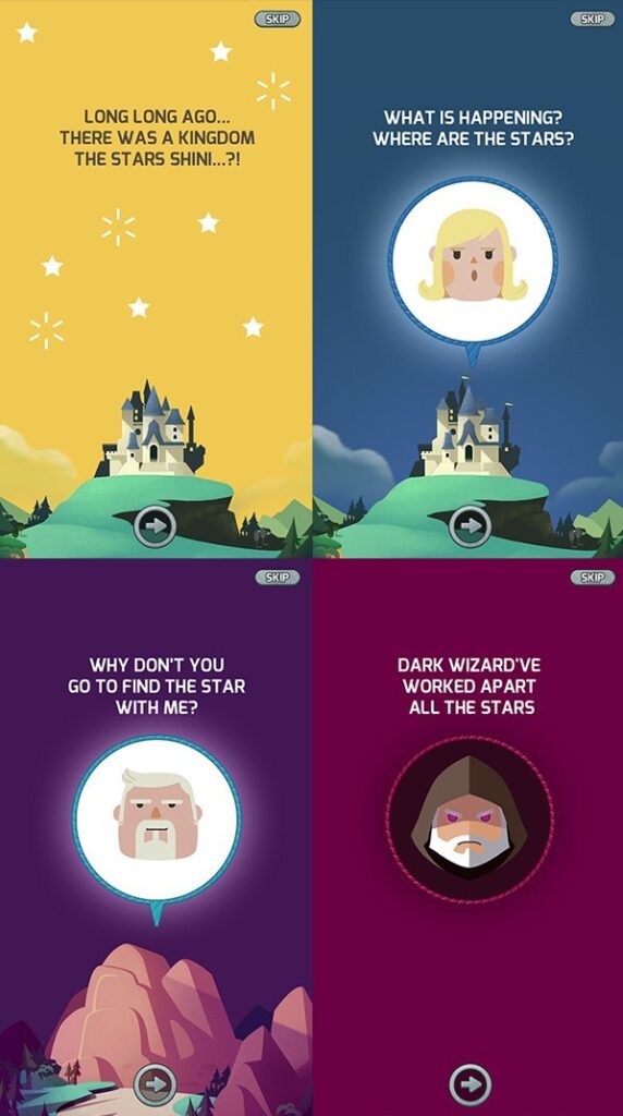
Visually appealing through story embedded in user-centric designs
Cube Master is yet another puzzle game, but it’s quite popular thanks to a simple storyline that guides you through your upcoming missions. The story is given a solid grit by an attractive UI and colorful design to make this game appeal to children as well as adults.

But your designs and animations should be in the proper context of the game events. A good game is recognizable through its user-centric design and features which help you connect better with what your player is thinking.
Realistic Goals followed by inevitable challenges
There’s no fun in hopping from one level to another of Candy Crush, if your 11 straight wins are not challenged by a tricky jelly brick combo level. Therefore, it’s very important to appeal to the EQ of the player in design. If a player doesn’t feel the heat of the moment, the dire need to win and the inevitable defeat in the game, there are good chances that your user will be bored.
At the same time, your player should clearly understand the logic behind the goals and game’s mission. Most importantly, each event, level, and target in the game should have a plausible plot. Absurd targets and vague missions are a strict NO if you want to retain your players.
Gamification
When a player has achieved a certain number of points, he should be awarded badges or rewards. A leaderboard should be maintained to keep a record of high scores. Awarding badges and challenging friends for different rewards, inculcate a sense positive motivation in the player to achieve more and unlock all the features of the game.

It also works when you have some extra credits to begin your day in the game. There should be enough currency with the player and a sufficient number of sources from where a player can earn and keep up with the flow of the game. Currency in the game often plays a crucial role for increasing in-app purchases, in turn keeping a player more engaged in the game.
Swipe your way through the game
Temple Run owes its popularity to ergonomics. Confused? I am just talking about the easy swipes to avoid getting roasted in fire or tilting your phone to avoid getting washed in the stream. Incorporate innovative gestures in the game to improve the gameplay and make it more natural and enjoyable. The players love to try new stuff and play with new techniques and this increases the user engagement. But it’s also essential to not overlap the already familiar gestures with some new action, since it may confuse the player and irritate them. For example, “pinch” gesture is used to either zoom-in or zoom-out. If the “pinch” gesture is replaced with something like jumping or dodging, it will confuse the player too much.
Where’s my water? Microinteractions stealing the show
To design microinteractions, you need to dive deep into interactions and break big tasks into intuitive smaller ones. Fun almost doubles when players uncover these tiny little goodies. It could be as small as finding a lever or a lock in The Room game or tapping to collect the hidden gifts in Farmville. Microinteractions enable a smooth transition of flow throughout the game. Animations can make changes more real and innovative and can immediately grasp the attention of the user.
Never let a player off the hook, always engage them on the app. Inform users about what’s happening on the screen and when they need to respond. It’s a clever trick to cloak loading delays, where interface keeps user busy when your app needs some additional time to perform the background action. The underlying principle is that don’t let your player get bored, show them progress, visual or audio, of the game so that they are always informed.
Know your gamer, their character, and their language

Games are no longer kid’s cup of tea, and that’s why you can see gamers of all ages in their pajamas hunting the next Pokemon at the nearest coffee shop… Oops, that’s Poke Stop not coffee shop anymore. Whether, it’s a middle-aged person or an old man, everyone loves to play to relax. So, target the majority of the population with your user experience. But this should never mean that your game is out of the reach of kids instead build a game that is adaptable and capable of catering all age groups.
Are you game?
On a gaming website, displaying the most important information or the major tabs on the homepage is essential. Everything on the website should be clearly categorized and sorted to facilitate effective usability. Internal website search is a good way to declutter the interface and providing the relevant information to the user.
While it becomes a lot more crucial to use the small screen estate of a smartphone in an intelligent way. You can use white space between buttons, larger icons, and colors, for better visibility and a smoother navigation. It’s best to design user experience which is inspired by the natural human behavior. Players will relate with the game easily and make the game more enjoyable.
BINGO! That was fun listing the basic UX design techniques for your upcoming dream game app project. Incorporate these features in your app and witness the boom it creates in the app market. If you need any proof, the overnight sensation Pokemon GO is the latest proof of that, responsible for bringing a huge surge in the Nintendo shares and overtaking the average time spent on Facebook and Twitter in just a week.
About the Author
Swati Panwar is a budding writer, presently working at Gamentio, an online 3D game portal. A technical writer by day and an insatiable reader at night. She is a gaming enthusiast and loves to play Online Teen Patti game.
Image Source 1 | Image Source 2 | Image Source 3 | Image Source 4 | Image Source 5 |
