
Kids do respond to good user experience, I happened to notice when my little 4-year-old ignored my old Android smartphone after using it for a couple of minutes. And then after some time I saw him playing with my iPhone 6S, he was too busy flipping, swiping, tapping his little finger through the various applications. Whether we want it or not, our kids spend a lot of their time online and gadgets have become a ubiquitous part of the entire growing up process.
If you think that kids are a minority audience when it comes to websites and apps, you are bluffing yourself, they are actually one of the most active and complicated audiences. In 2013, Apple introduced a kids category in App Store and it boasts of a stupendous number of 100,000 apps and that’s the proof of how designing for kids is a serious business. So, how to design for folks who are just learning to walk or speak?
Why it’s not just dumbing down the design built for adults?
Kids have much better-developed motor skills and though their attention span is short, they can process the screen elements in a much better way. What matters while designing the user experience for kids is how you can rope simple play activities, audio, and video into providing digital insights.
The destination is most important when it comes to designing for adults, but for kids, it all about the journey, the experience and therefore they can easily spot a bad UX from a good UX.
Why it’s so difficult?
Designers are not kids, they are adults who have a sophisticated way of designing experiences matching the grown up technology, preferences, and considerations. But they should not forget that designer should have empathy for their users whether they are grown ups or tiny tots who are just learning to walk or speak.
There’s no point in spending hours and energy in creating an app that too difficult or too boring for your target users, so before you pick you pen and paper to sketch, try to fit your monster feet into that cute little bootie through comprehensive user research.
What’s the best way to research your little users?
It’s all about observing them and learning how kids interact, what captures their attention and what bore them. But there are a few things which you should keep in mind when designing for kids.
1. Determine the target age group of your app, because kids grow really fast and so do their thinking, ideas, abilities, preferences, and way of operating things.
2. Moreover, kids are also a fast changing target group, a six-year-old is completely different from a four-year-old and every age group poses a different design challenge.
3. Some like to explore things on their own, while others need instructions to get started. Adults have their own goals to try out a design, but for kids, motivation is different and therefore products for kids need to be usable yet entertaining at the same time.
Researching your little users can help you
When you have determined your target age group, it’s time to observe them into how they react to design and the best way to do it to encourage them to involve in participatory design, sketching their own design ideas and benefit from their unprejudiced creativity.
Let’s look at the key determiners of building a good user experience for kids:
The wheel on the bus go round and round #Entertainment
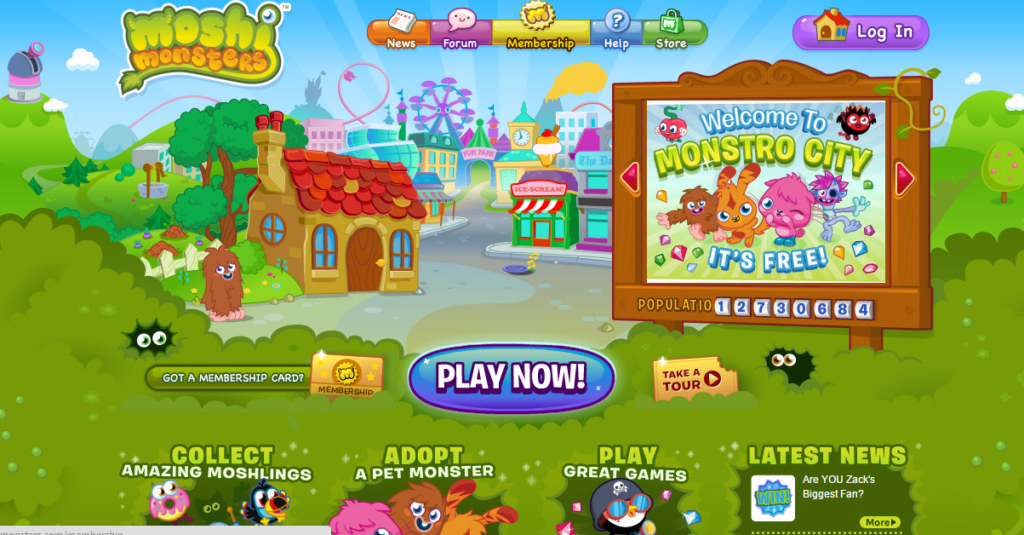
While adults have their own goals to try out a design, for kids motivation is different. And what better motivation than entertainment. Kids expect fun and surprising experience to keep their interest going in the products. They are more likely to share and recommend the fun experience to their friends and believe me mouth of words has a bigger impact on kids. Moshi Monsters has become one of the biggest digital entertainment brands for kids, blurring the line between games and entertainment with the help of its cute creatures and fun filled user interface.
Rainbow, rainbow, high and bright #Colors
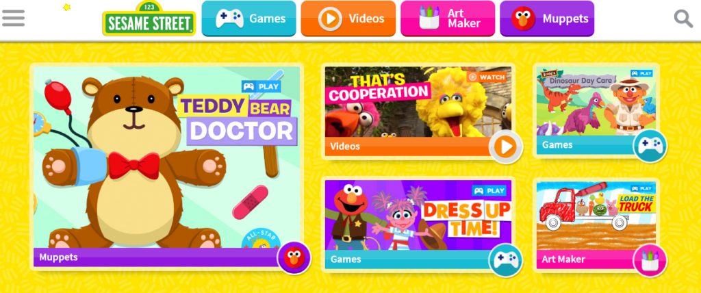
Looks is the first thing that will motivate the adults to try out the design on the first place, but it has a much bigger impact on kids. Bright and glossy colors tend to attract kids, so infest a lot of color in your design to make them attractive. Adults know that in a design, not everything is clickable, but kids feel that everything is tappable. Use colors, outlines and drop shadows to highlight what’s clickable and what’s not in an interface. An intelligent example is Sesame Street website, where they used a lot of bold colors and cheerful images, with even clear boundaries to define every clickable link.
Five little monkeys jumping on the bed #Options
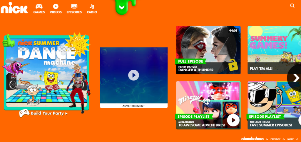
Navigation should be smooth in apps designed for kids, they should have full-screen menus to display options, and keeping them simple and outrightly clear. If you want your kiddy users to take an action, then keep the call to action buttons the most compelling, attractive and largest on the interface. Use the simplest of the words that kids can relate with what they have been taught in the school. No doubt Nick website is the most popular among kids with more than 7.5 million unique visitors every month, laden with full-screen images, colorful drag menus, and hundreds of options.
1,2,3,4,5, Once I caught a fish alive #Context
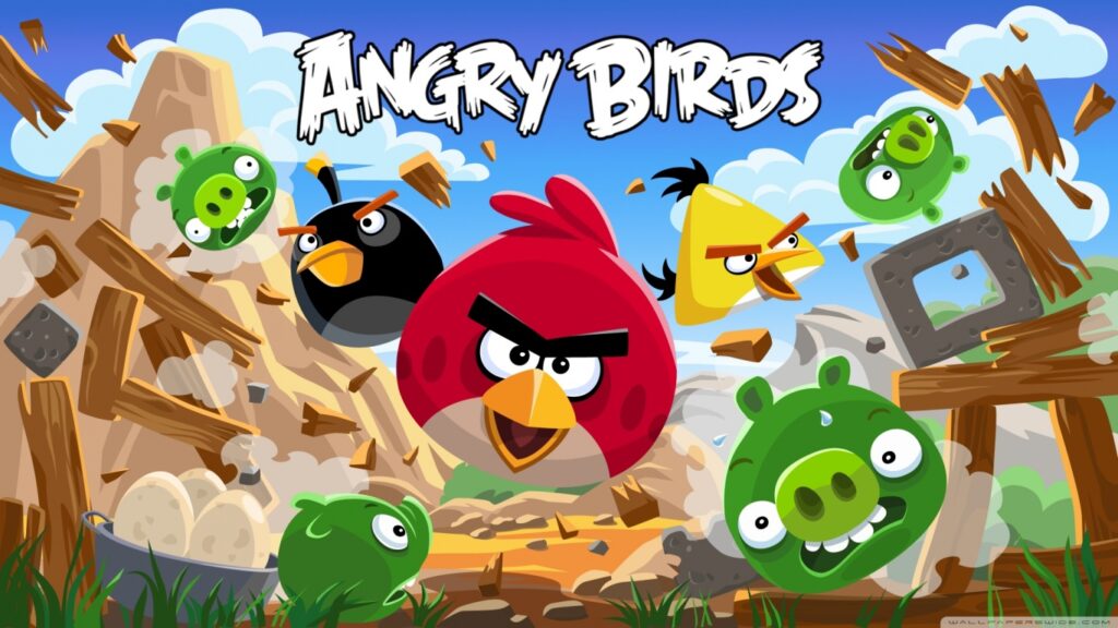
Kids are always eager to learn and they do it really well when learning is part of play. They also want more clarity on what’s happening on the screen and they want it every time something new happens, so give them hints to move and explain the way to arrive at the right solution so that they learn while they are interacting with your design. The Angry Birds Apps are a good example of how a storyline of pigs stealing eggs can be blend with a well-rounded explanation of what each bird is for, along with throwing hints in between to introduce them to new features.
Old Mcdonald had a farm E-I-E-I-O #Sound
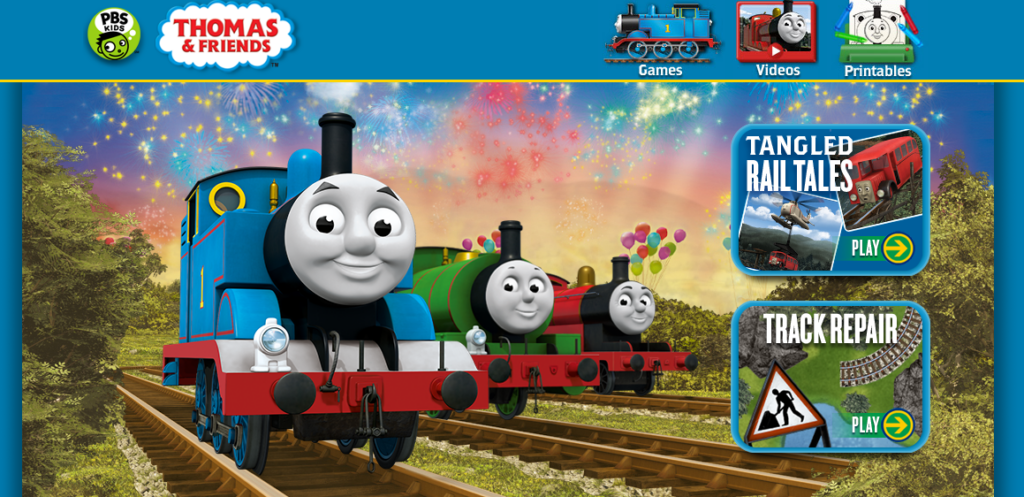
Some of your target group kids might not have started how to read yet and much more might be struggling to remember the meaning of the words they just learned. So, integrate sound into your design as a fun way to give feedback and provide instructions to your little users. Thomas and Friends on PBS Kids website have not just big colorful pictures with text but also has audios to read the navigation items loudly to its youngest age group of users.
Why should you not forget parents and teachers?
While all your focus is on kids, you should not forget that it’s the parents and teachers who hold the spending power. Kiddy apps require the care and consideration at the basic steps, but you should also take care of your second target group in your design. It’s just not enough to increase the level of excitement among the kids, your design should be something that should appeal to parents as well.
Designing UX for kids is all about ensuring how educational topics and gameplay can be integrated into the interface. The digital experience for kids should ensure a structural and systematic flow of information. The visual design should focus on discovery and exploration in the most meaningful way. Your little audience can be really straight forward with their responses, praising on cool interactions and tough on the bad interfaces.