Humans are working day and night to make things more efficient every day, reducing timeframes from months to days to hours to minutes to seconds to milliseconds to microseconds. Something similar is happening in the design space too, it’s not about designing interactions anymore, it’s to delve deeper into the basics and coming up with something that closely touches the life of users, through microinteractions.
The term microinteractions is suddenly everywhere from banking, insurance, healthcare, to retail. So what are the microinteractions? They are the product moments that delight users while performing a single task. It can be something as simple as setting an alarm to posting a pic on Instagram or boarding a Volvo bus without even looking up from your smartphone.
What’s hidden in the box of microinteractions?
Everyone’s going gaga about microinteractions in UX too, but it was always omnipresent in design. Yes, you are more likely to notice a bad design due to its loopholes, but did you ever stop and admire a flawless design? Nope, a good design is mostly ignored. It’s the fluidity and beauty of experience that we fail to notice how seamlessly our tasks are integrated into the interface.
Microinteractions are responsible for making the interface feel seamless, holding the entire experience together and helping a smooth transition of user flow through your design. Dan Saffer highlights in his book Microinteractions that they can add value to functions such as communicating feedback or result of an action, accomplishing an individual task, helping users visualize the results of actions and preventing errors, and enhancing the sense of direct manipulation.
Microinteractions, seamlessly integrated into our life

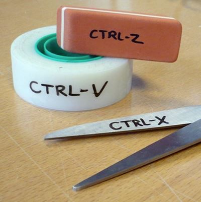
Ctrl+C or Ctrl+V is a kind of smooth interaction that made copy paste a lot easier, or else we had to follow a long route of accessing these simple activities from the right click menu.
Central remote locking and keyless ignition are excellent examples of microinteractions in all the latest vehicles. While central remote locking bumped off the need for locking and unlocking the doors every time, keyless ignition went a step ahead by not just locking the door but also turning on the ignition. Not just that, there are other models of cars with responsive door handles that detect owner’s presence to personalize the experience.

Then the recently launched Facebook reactions. Facebook took years to come up with something better than Like button and they got a thunderous response to their reactions. Not only the six emoticons are lively but they also give users a way to express more than a mere Like, without flooding the comment box.
In the same way, microinteractions can be embedded in potential actions to bring out the usability of the product. Microinteractions are gaining a foothold in different aspects of UX designing such as
- Turning on/off features, functions
- Modifying settings
- Notifications, status messages, comments and more small pieces of content.
- Sharing on social media
- Pull down and hidden menus
- Highlighting changes
- Call-to-action buttons
- Downloading, uploading and connecting to devices
How to execute microinteractions in design
These are only a few examples where microinteractions are becoming a necessity, let’s find out how little microinteractions can improve designing user experience in a huge way:
Fast response time
When your system responds faster to customer’s queries, they feel that they are in control and automatically this delights them.

Keep user informed
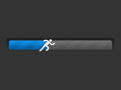
One of the most important usability principles is to always keep your user informed, even if your system is going to take time, a delightful loading bar or status icon will keep them engaged.
Context
Keeping user informed is good, but they should also know the reason why changes are happening on the screens, or why certain elements are arranged in a particular way so that the transition between navigation is smooth and effortless.
Single theme
Visual cues and animations can pave the way for clean navigation between different pages, making them easier for users to understand. Microinteraction can be as simple as a unifying theme on the web page to tie all their interactions together.
Space constraints

In smartphones and smartwatches, space is limited and here you should be focussing on how to use the existing elements to deliver the message and not clutter the interface with more than necessary elements.
Scalability
Microinteractions should not be designed for the current requirement, scalability should always be in the back of your mind. The microinteraction should always be delightful for the users, it should not become a distraction when used for multiple times.
The human factor
Human-centered design approach is the smartest way to create microinteraction. You can use emotions to make users feel warm and welcoming when asked for performing a task like asking for feedback and requesting for information.
Simplicity rules
Microinteraction is supposed to accomplish just one task, and therefore it should ideally be small and simple. You should not broaden its reach by mixing it up with macrointeractions.
Visualization

Visual cues and animations can pave the way for clean navigation between different pages, making them easier for users to understand. But the motion should be seamless with microinteractions bringing visual harmony.
How microinteractions are making your life more efficient
Microinteractions are designed in a way that they are supposed to stay invisible in the interface, but providing visual delight to users once discovered. Dan Saffer has highlighted that all microinteractions should have a trigger, rules, feedback and loops/modes. They are the facilitators for interactions with feedback, notifications, instructions and sometimes even a little entertainment. Microinteractions are here to stay, they will prove to be the biggest time savers, instantly communicating information without distracting the user in the long run.
Image Source 1 | Image Source 2 | Image Source 3 | Image Source 4 | Image Source 5 |
