Holidays are the busiest time of the year for everyone, and it’s difficult to think about anything besides family, shopping, and drinks. But if you are still in the middle of finishing some last minute work and juggling between the nuances of User Experience and User Interface, and would like to catch up with best write ups on UX, you are at the right place.
We’ve got the most wonderful time of the year covered and rounded up the top five must-read articles of the month, so you don’t miss a beat!
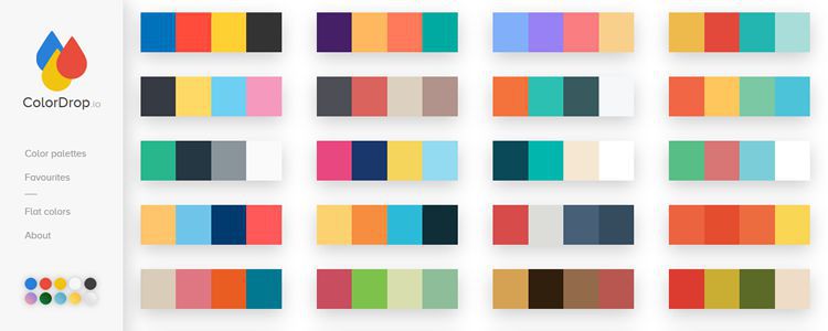
50 Tiny, Time-Saving, and Free Tools for Web Designers from 2016

If you are a web designer who is actively involved in designing web pages, mobile applications or visual identities, the first few things you’ll need are a pen, paper, and your imagination to make a sketch of your idea. But pen and paper are not enough to build a professional looking website, you will need the correct tools and it’s difficult to find the best ones. SpeckyBoy has made the job easier by listing down the best tools for web designers from 2016.
How not to design web forms
Every website has a goal, to connect the right folks with the company. What happens when you found the right one? Let the other side know of your presence through forms. It’s the most crucial element of web design; helping you to complete purchases, sign up for email lists, social network, discussions and what not. However, a few buttons, subtle colors, and impressive typography are not going to do the trick for forms. John Moore Williams of WebFlow tells you exactly what not to do with your web forms.
4 Ways to Improve Usability and User Experience by Decluttering Designs
“Simplicity is the ultimate sophistication.” was the tagline of Apple’s first marketing brochure in 1977. The BARE MINIMUM trend is making a comeback. But it’s very hard for designers to come up with something simple and make something clean, fun and friendly. Paula Borowska from Design Modo has four valuable decluttering tricks for designers that result in improving the usability of websites.
Hamburger menu alternatives for mobile navigation
Hamburger menu is great, saving a lot of space and paving the way for a simple and clean visual design. However, some designers got it completely wrong and hide the most important information behind those three straight lines. Some places it does make sense, but companies are using it more frequently and where it’s not required. Why hide behind lines when there are some really good alternatives available. Zoltan Kollin has explored some better alternatives to hamburger menu for mobile navigation.
6 Web Design Style Predictions for 2017

Design is ever changing and ever evolving. But it can be really challenging to stay updated with the latest design trends when design trends are changing every day. Even we have come up with our own compilations of UX design trends for 2017. The new web design style predictions from Envato include microinteractions, iconography, shadows, mockups, color gradients and much more to make it a worth read.
We are in the race too…
Once the loud party music of New Year Celebration will die down and give way to the busy month of January, the eCommerce companies will review returns on holiday shopping discounts and start prepping up new business strategies for 2017. So, we came up with our most talked about eCommerce UX trends for 2017, that will ultimately help you bag the necessary attention after the bells and whistles will die down in the beginning of next year.

Hope you enjoyed the top reads of November. We’ll be back next year, till then, have a festive holiday season and a very Happy New Year.
