Nonprofit organizations are the supporting world for needy people and also a great medium for the supporters to connect with the cause. However, the digital platform of all nonprofits and charity organizations is not up to the mark and fail miserably on the user satisfaction. Without offering anything unique, how can these charities persuade people to give their precious time and money on their platform?
Moreover, there are a variety of personas that are abreast with the nonprofit organization. It could range from donors, volunteers, event enthusiasts to people visiting the platform for information. Every user comes with different motivations and subsequently, the user journey has to be optimized to let them perform the desired action. Learn how keeping a few UX parameters in mind can help you tap these triggers.
User RESEARCH will help you build the right user JOURNEY
Like all other experiences, it’s mandatory for even nonprofits to understand their users. It’s better to know your donors/volunteers and what exactly delights them. This can be achieved through exhaustive user research to find out market needs, potential users, and feasible set of features. Data can be gathered through activities such as surveys, stakeholder interviews, usability reviews, focus groups, competitor benchmarking, and user interviews.
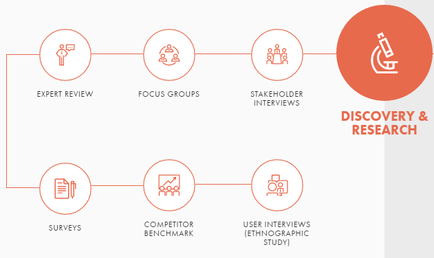
It gives stakeholders a holistic view of user behavior and what motivates or inspires them to make a donation or sign up for a volunteering activity. This will even ease out the process of designing communications on the website.
GUIDANCE at each step could make users donate more
Homepage is the gateway to nonprofits’ brand, introducing and informing users about the motivations and inspiration behind the cause. But the varied personas demand multiple landing pages, each designed to cater a different user journey. Moreover, it’s not necessary that user will always land via the homepage, so every page should feature the mission, essential for understanding the value of nonprofit and how they can contribute.
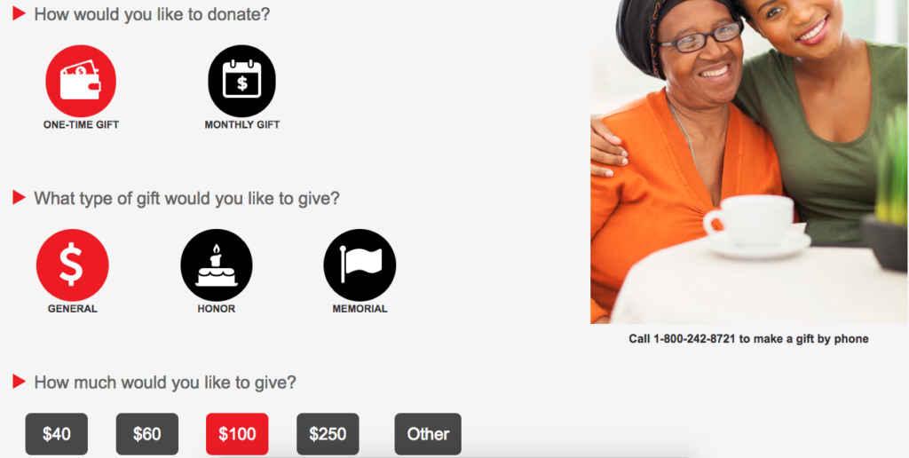
It’s also not wise to confuse your readers by packaging too much information on each page. Instead of cluttering, the visual information should be able to guide the users to narrow down their goals and take the relevant action through proper CTAs. For example, if a page is about how volunteers are making a change in the lives of many, then the call to action should be about signing up for the volunteering activity.
Social MEDIA CLICKS will make your charity popular
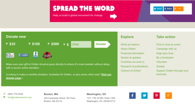
Social media has been the most effective medium for a nonprofit organization, which relies hugely on the word of mouth. It’s responsible for creating instant conversations and create awareness about the cause. The engagement opportunity through social media should be omnipresent on the nonprofit website, giving people a chance to share their cause with their friends and family. It should be at every step right from when they are signing up for a cause, to creating their own personal fundraising web page, volunteering, or making a donation. For example, the viral campaigns such as ice bucket challenge created awareness about the amyotrophic lateral sclerosis disease globally.
Like every cause, each website page counts
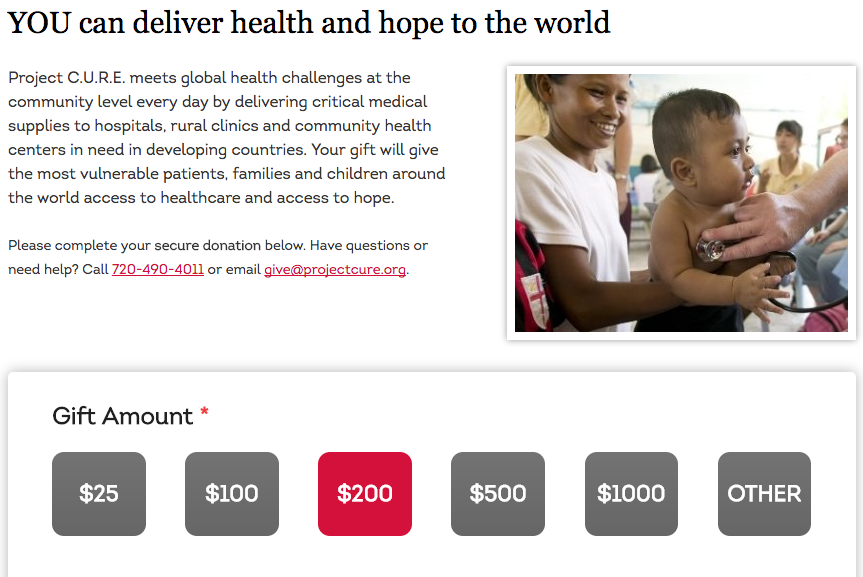
While donation is the primary goal of any nonprofit, you can’t let the donations become the central theme of your website. There’s a step-by-step process of converting visitors to donors, including educating them about the mission of the website, building a connect and then subtly ask for a contribution. Exploring the different pages and a well-designed information architecture makes this possible. The information on the cause, history, facts, and stories that people can connect with, result in an impactful web design. It’s important to capture the emotion generated through each story by social sharing, email subscription, forums, market, volunteering and donation button.
Stories that people can connect with and persuade them
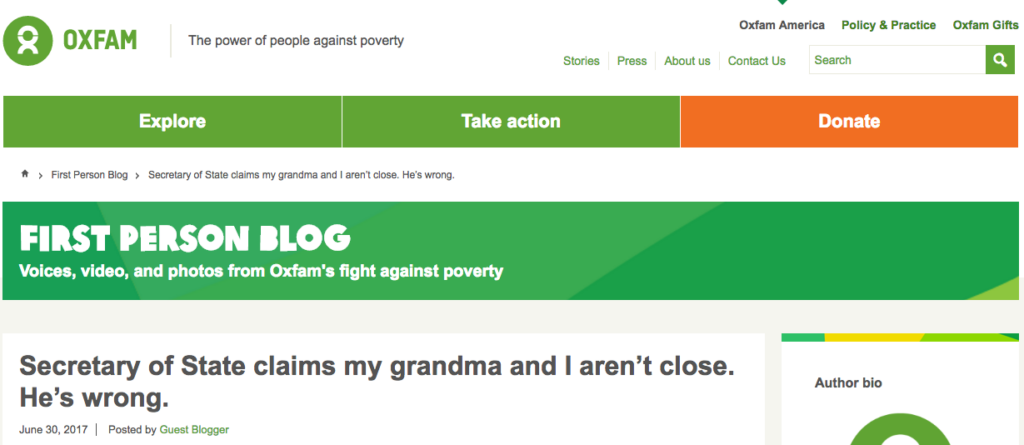
Storytelling is a trend that’s universal to all web designs. The users can easily get overwhelmed with a plethora of content. However, they want to listen to a story to build an emotional connect. Every nonprofits should be able to tell a unique story. Storytelling makes way for a compelling content, allowing the audience to care more about the cause and the people they will be able to help. Strong connect also paves the way for building loyalty and a long-term relationship. While content is a great way to tell stories, images and videos have a wider effect. People are even using animations and live action videos. Furthermore, the latest trend is to encourage users to generate content to capture storytelling on a website.
Trust is, what that results in a loyalty
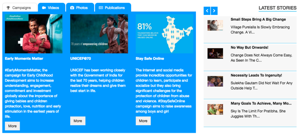
It’s good for an organization to give an idea of the culture and people that work there to build trust. This includes sharing the information about the stakeholders and the people involved in the organization. It’s most important for nonprofit to build a lasting loyalty and trust among its users. It’s must that you be transparent with your users, whether it’s in terms of financial data or showing the impact of your efforts.
Make your website accessible on the go
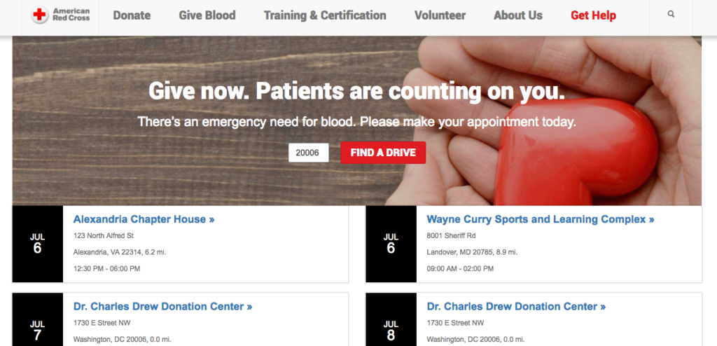
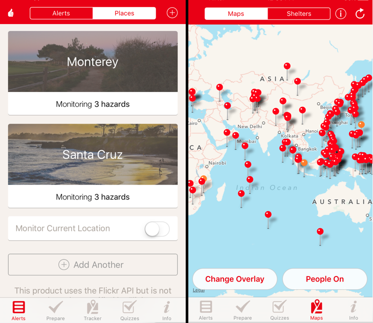
Most of the world’s digital population is accessing the Internet through their mobile devices. Therefore, it’s essential for nonprofit to support the mobility aspect as well. Being available on a wide range of devices is not enough. But a consistent yet smooth experience build a trust and encourage them to make payments. Therefore, it’s imperative for nonprofits to have a responsive website that can adapt to the different screen sizes.
Bridging the gap
Recent research highlights that there’s an increased likelihood of donating behavior if the user is able to complete a task. With proper user research, you can sketch personas, user journey maps, and drive user towards goal completion. Good UX with a blend of impactful content could influence consumer behavior and increase conversions. If you want to increase engagement on your nonprofit website, Inkoniq would love to help you.
