
Skeuomorphic became the apple of everyone’s eye, when Apple introduced the goodness of touching the real buttons on glass in first iPhone. It was the first time when people used touch and got instantly smitten by the interface that feels so real. Skeuomorphism was in vogue for a few years until Microsoft stripped design of all real-feel-ness and came up with flat design powered Metro UI.
No trend lasts forever in the competitive world. After the success of skeuomorphism and flat design, Google stepped up to take the best of both worlds to build something more meaningful for the future generations. That’s when they unveiled Material design. Let’s look into the pros and cons of these design approaches.
What’s Skeuomorphism?
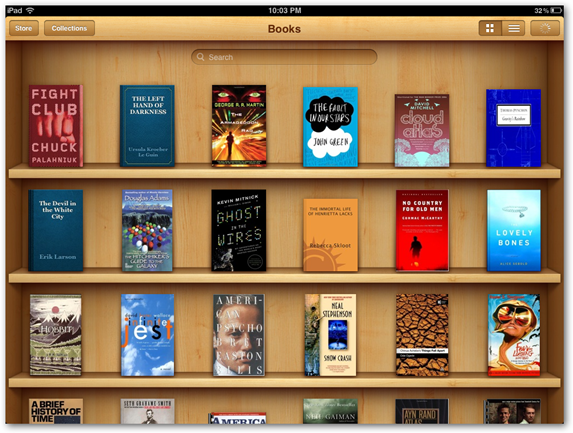
The design is not as complicated as the name suggests. In Skeuomorphic design, elements are designed in a way that they resemble their real life counterparts. Apple wanted users to connect with iPhone, a drastic transition from bar phones to touch phones and therefore stressed on making the experience as real as possible. For example, the first iBooks app has a 3D wooden bookshelf showcasing your book collection in the most realistic way.
Why skeuomorphism or realism gained popularity?
The design looks intuitive and causes a strong feeling of familiarity. As the design elements resemble or mimic the worldly objects, it’s pretty easy to relate to them. This design is a boon for perception where it’s easy for users to anticipate what buttons are for and how it works. It’s a rich design with detailed visual elements that look stylish and has more visual cues on how a task can be performed and therefore results in a very engaging user experience.
The downfall of skeuomorphism
Skeuomorphic becomes unbearable when it’s been overdone. The real life elements have a feel good factor in the beginning, but it becomes redundant when it starts hampering usability. If a task that can be finished in a single tap takes 3 to 4 steps to complete just to make it look real like, it becomes an overhead. It’s also not the most usability friendly design, where the interface is flooded with decorative images and therefore a major portion of screen space is wasted, not good for mobile too.
Like fashion, user interfaces have an expiry date too, they tend to appear boring after some time and novelty is needed, but innovation has a very little scope in skeuomorphism to keep the familiarity with the designs intact.
Rise of flat design
Blocks of color with big typography has always been there in the design, but no one used it in the better way before Microsoft. The Redmond giant is responsible for bringing simplicity back into design after an overdose of realism. Flat design is a minimalistic approach that focuses on usability and featuring open spaces, bright colors and two-dimensional flat structures instead of shadows, highlights, and gradients of skeuomorphism.

It’s a box full of goodies
Antoine de Saint-Exupery once said, “perfection is achieved not when there is nothing left to add, but when there is nothing left to take away”.
In this design, decorative elements are seen as a hindrance to the user experience and therefore every element present on the screen serves some purpose. But the lack of flashy stuff doesn’t make this design is boring, it uses the bright contrasting colors, hierarchy of objects and typography to grab attention and guiding user effortlessly throughout the product.
As the design is clear and not many design elements need to be loaded and created, this design boosts performance, cleaner code and easy adaptability. As it is designed to fit an on-screen experience, it adapts itself seamlessly on all devices, making it a perfect fit for responsive designs.
Awe missing from awesome
Users rely on a few subtle cues to move forward in an interface, but stripping all cues leads to a confusing interface and many questions that remain unanswered. For example, if you look at the controls and settings shortcuts of Android and iOS, it’s really difficult to figure out if a particular button will turn off or on the application or tapping it will display more details to configure it.
Embracing simplicity is great for designs that need minimal visual cues, but its limiting when it comes to visual complexity and branding. It’s really difficult to be unique or intuitive with a flat design with all sites appearing more or less similar.
Add a pinch of skeuomorphism into flat design and Voila, you’ve got Material Design
It should have been limited to Apple Vs Microsoft … err Skeuomorphic Vs flat debate if another giant hasn’t stepped up the game. The search behemoth Google has emerged to be a serious contender with material design, an amalgam of skeuomorph and flat design, that can be described as skeuominimalism. It has taken the purity and simplicity from the flat design and blended it with the shadows and gradients of realism.

Goodness from Google’s lab
Although the focus is still on a clean interface, the Material design makes things real by introducing the Z-axis with the help of interactions, colors, and shapes. Its intuitive nature is easier to use than flat design and being from Google’s lab, it has ample resources, a very detailed set of guidelines to answer all doubts. Animations or the motion in web design is the cherry on the top, helps users grasp on screen elements and guide them to the most important element, where their attention should be.
Where it falls short
With the spotlight is on motion and z-axis, it takes longer to implement than the flat design. Moreover, animations can be a little unhealthy for your smartphone’s juice also and heavy layered designs can increase the loading time thus affecting performance. The Google’s guidelines that are crucial to material design might also conflict with the creativity of designers and limit the evolution of better animations and features.
User first design is the best design
Every design has its own significance and it has to be picked based on the product requirements and target audience, not because it’s in vogue right now. There was a time when skeuomorphism was considered revolutionary, but then it became redundant and flat design mania took over.
Flat design, which is most popular may not a perfect fit for rich branding websites, and skeuomorphism is still the best pick for gaming UI. The design language should match the vision of your product and the goal you want to drive through it.
Image Source 1 | Image Source 2 |