
Accessibility is ignored by designers, as they often relate it to boring designs, text only websites, monochromatic colors, and static content. But accessibility should not be vetoed from your discussion just because you think it’s either complex or boring, because it’s not.
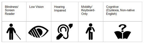
A true digital experience is actually incomplete without an amalgamation of creativity, usability, and accessibility. Yes, you heard it right, and there are a few reasons to support this. As much as 14% of the population consider themselves to have some kind of disability, this counts for one out of your seven potential customers. But wait… there’s more, over 10% people have color blindness, 4% people with troubled vision and over 20% of the elderly population struggles with mobility and vision issues.
Whoa! that’s a whopping 50% of your potential customer base, now can you afford to ignore them? Nope, then how to make your design accessible, it’s not as complicated as rocket science, we’ve got a few easy tips for you to make a switch.
Follow the rules
There are some industry standards for website accessibility, compiled by the World Wide Web Consortium (W3C) and called as Web Content Accessibility Guidelines (WCAG) and most popularly known as POUR (Perceivable, Operable, Understandable and Robust). The website is evaluated based on these criteria and accorded A, AA, AAA success categories to support different levels of accessibility. Level A stands for basic accessibility standard, while AAA for advanced.
For example, Guideline 1.4.1 is about the use of color and it highlights, “Color is not used as the only visual means of conveying information, indicating an action, prompting a response, or distinguishing a visual element (Level A).”
This is just a level A guideline and it ensures that content with special meaning is distinguishable from other content not based on their color, but by some other way too. To throw a little light on it, take an example of a form, the mandatory information boxes should not be just red, but should have a tooltip or a warning icon next to it to make it clearer. Keeping it red will make it difficult for color-blind people to distinguish between mandatory and not so relevant fields.
The WCAG guidelines cover each and every aspect of accessibility best practices in detail and you can choose to stick to the level that works well with the needs of your user base.
Visual design should be flawless even for special audience
Colors and fonts are what eye notice first and therefore are the biggest drivers of a beautiful and intelligent design, but most of the times, they become roadblocks for accessibility. However, it doesn’t mean stripping colors from your website or flooding it with larger than life fonts. But optimize them to support accessibility.
The background images or videos should never cloud the readability of your website content. Even if you’ve got your perfect type, choosing low contrast for your font and also background color will make reading difficult. There are a few tips you can follow for typefaces, depending on the level of accessibility you require on your website.
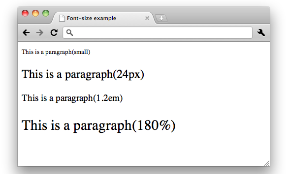
- The font size of 24px or 19px bold or larger is perfect for accessibility.
- WCAG highlights that the ideal contrast ratio between text and background should be at least 4.5 to 1.
- But if you are using a font at least 24px or 19px bold, then the minimum can drop to 3 to 1. Smaller size text should have greater contrast.
- Similarly, the lightest gray can be used on a white background should be #959595 when the text is 24px or 19px bold or larger.
- But for a smaller text, it should be #767676.
- When you move towards the darker background, the text needs to be darker too.
- Inactive buttons, menu items, logos, and elements in a disabled state are exempted from this rule, but follow it for placeholders, ghost text and form fields.
You can use tools to find an accessible color palette for your designs like ColorSafe or WebAIM‘s color contrast to test the contrast of your colors.
Accessible for everyone on everything
Your users are everywhere, not only across the globe, but also on multiple devices such as smartphones, tablets, laptops, and desktops. Therefore, it necessary to make sure your design is consistent and user-friendly on all devices. It doesn’t necessarily mean just a responsive website, but a website that can be even accessed through even screen readers with keyboards and joysticks used for navigation. You can focus on making the buttons, menu options and link targets large enough to be accessed by joystick mouse, large buttons will also help people with arthritis or dexterity difficulties or simply fat fingers.
HTML5 rocks
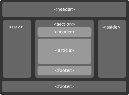
Semantic HTML5 elements help screen readers to convey page content more effectively. For example, header tags impart hierarchical importance to the text and tags like <strong>, <em>, <time>, <address>, <nav> and <article> for content and site structure. If used correctly, it will ensure a clean code and also devices will understand how different type of content on screen are related to each other.
Be more descriptive
Screen readers browse a page via keyboard interaction and read key content on every new page load, primarily navigation, and header content. It’s a good accessibility practice to include an invisible anchor link, just before the navigation for easy jumping to main page content. It is to help user skip the repetitive link dictation. Similarly, link texts can be more descriptive, like Skip to Home Page is better than a mere Skip Navigation or Click Here to Read More About Flat Designs make more sense than plain read more, click here or view more, for screen readers.
No Icons, prefer text
Icons are beautiful but leave the user with an extra activity of understanding the icons. Not everyone interprets icons in the same way as different cultures have a different meaning for different icons. They are bad for screen readers too, and therefore text based navigation has an edge over icons in accessibility. You can use this excellent resource on ARIA Labels to ensure that your icons are accessible to screen readers. It’s a same kind of problem with hidden hamburger menu, there should be a visible link to get to the hamburger menu for accessibility.
Test your accessibility
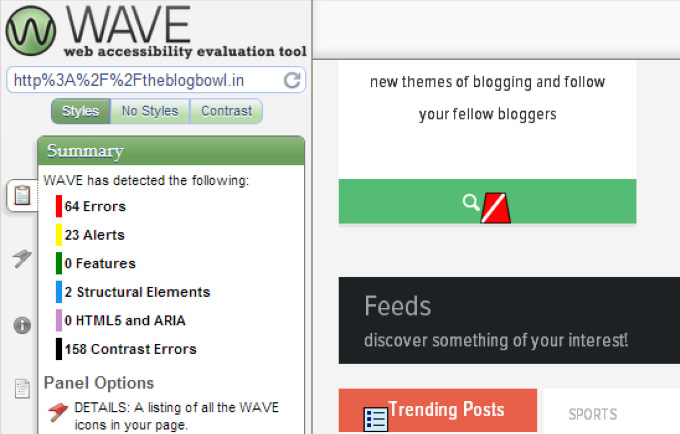
Whoa! That’s a lot of information to digest, so after you’ve applied various standards of accessibility and you are still unsure if you are going the right way, there are tools to make your life easier. You can use tools like Web Accessibility Evaluation Tool (WAVE) to evaluate color contrast, markup, and structure.
You can even try your hands on screen readers to understand or navigate a website or enable voice over tool on OS X to listen to your site. You can access it through System Preferences > Accessibility > VoiceOver > Enable VoiceOver.
Wrap it up
If half of your customer base can’t convince you to design for accessibility, then it’s sad. Remember that, if you won’t cater to this base, someone else will and there you will be out of business very soon. The other half is also looking for something innovative and creative from your side and accessibility gives your customer additional reasons to love you.
Image Source 1 | Image Source 2 | Image Source 3 | Image Source 4 | Image Source 5 |