
Machine Learning and artificial intelligence have been buzzing the industry with the power and potential of big data. Suddenly, companies are getting aware that they could do some much more with the ocean of information that was just lying around with them. They can redefine their customer experience and explore many hidden entities of their business. But sometimes it seems impossible to mine these infinite data sets for those tiny bits of valuable information.
Who likes a jumble mumble of data? Simplifying BIG DATA is not only about building algorithms to crack the data and bring forth the meaningful information. But also about the front end intelligence. This is where most of the big data companies are struggling, unable to create an impactful data visualization design that helps them in identifying the patterns, which lead to valuable decisions for the firms, in turn adding more numbers to the revenue.
Before we jump into the design aspects of the data, it’s better to understand the data components that will lead us to the best data visualization design. Data is of different types, there’s QUANTITATIVE data that can be counted or measured, there’s DISCRETE data with a finite number of possible values. CONTINUOUS data that can be measured and has a value within a range, and CATEGORICAL data that can be sorted according to group or category.
Here are a few practical design tips that can help you in creating intelligent graphs and charts for a powerful data visualization design.
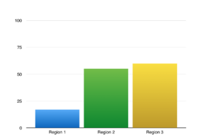
Bar Charts are the most familiar design and make it easy for viewers to spot the relationship. They are especially useful for comparing data happening at a static point in time, showing change over time, compare different categories or compare part of a whole.
Bar charts can be Vertical, best used for chronological data like time series or,
Horizontal where same variables are compared across multiple categories or,
Stacked, to not just compare but to view the data breakdown of each category.
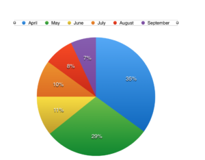
Pie Charts, as the name suggests, shape exactly like a pie, is the second most popular chart design for small data sets. They’re best used for making a part to whole comparisons with discrete or continuous data. While the Standard pie charts are used to display the part to whole relationships, the Donut version is used mostly to make a style statement. But pie charts are criticized in the design circle, as it’s a little hard to determine the exact data numbers and relative sizes of pie slices.
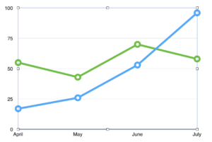
If you are talking about time, talk about Line Charts. They work much better when you have continuous data and you want to show the time series relationships, visualization based on trends, acceleration, volatility over a period of time.
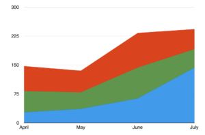
Area Charts are again your best bet for time series relationships, for trends and comparisons. It’s same as line charts, so you can use area charts to represent volume too. However, it’s not an ideal setup for fluctuating data values.
Scatter Charts are ideal for correlation and distribution analysis. They are especially relevant for bringing visibility to the relationship between items based on two different variables that are correlated with each other. It’s bang on to spot any anomalies in the data distribution or clustering trends in a scatter chart.
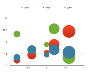
Scatter charts allow you to compare two numerical values. However, if you want the comparison with a third variable, you can go for a Bubble Chart. You can perform linear or nonlinear comparisons, ranking relationships or presenting patterns among the large set of data with this chart.
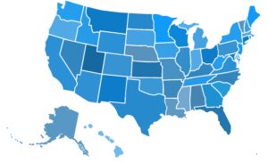
You can spot trends, outliers, and best and worst performing areas based on the geographical context using Map Charts. It displays the categorical data with mostly location data coordinates like country name, state names, or addresses. The intensity of the color represents different values. Generally, multiple shades of a single color display the intensity.
Our favorite DOs and DON’Ts of data visualization
Use the type of chart wisely. It should visualize data in such a way that it makes it easy for readers to compare values.
- You shouldn’t use more than six colors in a chart. Furthermore, use only a single color to represent each category. In a map chart, use different shades of the same color to display intensity.
- If time is one of your variables, represent it on the horizontal axis, running from left to right.
- It’s all about reducing complexity in charts and therefore, never add too much information in a single chart. Remove any excess information, lines, colors, and text and distracting typography decorations from the chart that add no extra value.
- You should sort data in ascending or descending order by value and not alphabetically, in bar, column or pie charts.
- You should use the labels directly on the line, column, bar or pie to avoid the indirect lookup. Use callouts especially to highlight important or interesting information. Use icons to avoid long and lengthy labeling.
- The color combination should be soothing and not high contrast. Moreover, over 7-10% of men are color deficient, hence choose colors keeping them in mind.
- Avoid using 3D effects or blow apart effects that reduce comprehension and makes it hard to compare elements.
Designing for data visualization is not a rocket science!
Bar charts are for comparisons, line charts for visualizing trends, Pie charts for compositions and scatter charts are good for displaying relationships. To create valuable charts, you only need a basic understanding of data type and how data sets are visualized. In addition to this, you need strategic thinking to avoid the common pitfalls of picking a wrong chart type.