
Whether it’s a long trip around the world or a short weekend getaway to a solitary nearby jaunt, a vacation is one of the most rewarding experiences of being alive. All you need to do is backpack and vehicle tank full of fuel to kick start your weekend fun. But, if it’s a long trip, there are many things to be taken care of, flight tickets, hotel rooms, car rentals, local sightseeing, entertainment deals to start off with.
Travel and hotel sites take the agony out of trip planning, but mostly suffer from a terrible user experience. However, there are some players that managed to provide unfettered access to sizzling hot locales and still let you bag the best bargains. Let’s find out how top travel websites are using the UX power to create meaningful and fun experiences while letting you plan your vacations easily and quickly.
The all-in-one package
Trip is not just flight bookings or hotel deals, it’s about traveling essentials, expert tips, inspirational advice, destination information, and much more. But you won’t be scrounging for information on multiple pages or sites, you will actually need a single landing page that can take care of all your traveling needs.
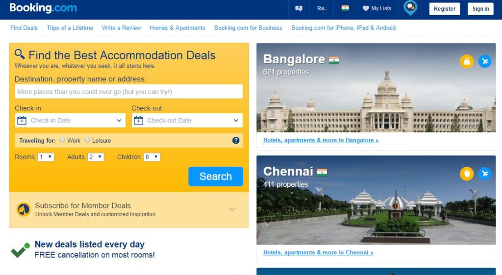
Booking.com has a nice layout where half of the space is designed to provide a quick access to site’s vital function that’s hotel booking and the rest of space features the popular traveling destinations. That’s such a relief for visitors who don’t have to browse any irrelevant content. In addition to this, home page also features last booking history, a section highlighting the free cancellation policy and even the 6 benefits of choosing booking.com for your lodging.
Travel is all about high-quality visuals
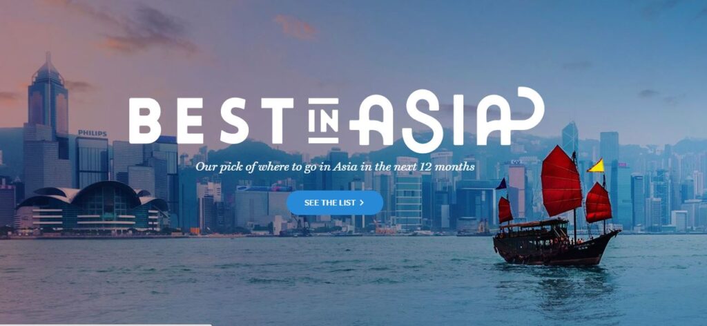
Travel is all about gleaming turquoise waters, white-sand beaches, snow-capped peaks, exotic villages, scintillating metropolises and even lifeless deserts. Destinations that are so colorful can’t be crammed behind the boring visuals. In the small screen estate of smartphones, it’s little difficult to enjoy the untouched beauty of these places, but websites allow users to experience the places before they actually step out there. Lonely Planet website uses bright colors and magnificent photos to bring life to the cheerful and mysterious mood of the places they feature.
Visual navigation
Navigation is crucial when it comes to travel websites, it’s all about the visual cues, sliders, cards and widgets that guide users across their destinations and detail the places. The Cruise.Me website features an interactive map of destinations, displaying the cruise locations with the budget. The design is pleasant and friendly, letting users decide the locations and tours based on their budget. It’s a far better design than a drop down where you will be selecting the location first and then browse through the results to see if it fits your budget.
Streamline your forms
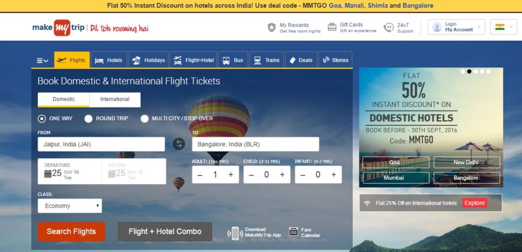
While there are traveling websites that club all features on their interface, however too much of clutter actually kills the fun. Same is the case with complicated forms with too many fields that lead to the instant departure of visitors. A smart way to hide forms is a mega drop down menu so your website is a beautiful visual treat, featuring a range of detailed forms hidden without making the screen littered. MakeMyTrip has six different search forms for Flights, Hotels, Trains, Car rentals, Holiday Packages and Flights-hotel combo. Users can directly select the service they are interested in, from the forms on the home page and need not be bothered by the extra fields of other forms.
Simplicity with modern elements
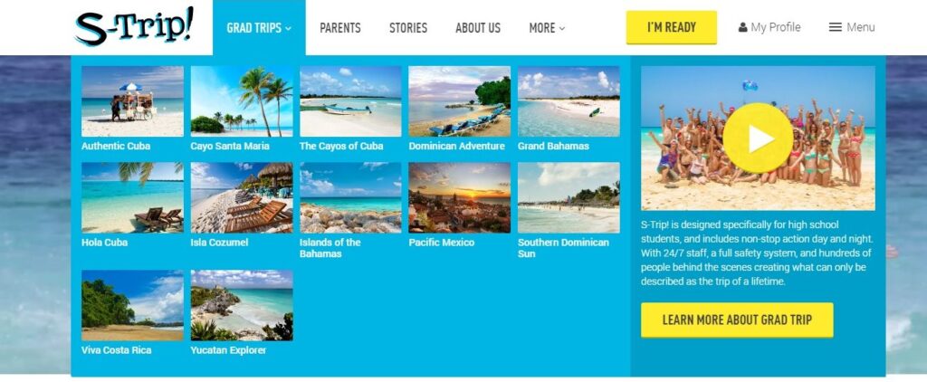
The S-Trip website has a lot of content, images, videos and widgets for every destination, but a drop down navigation with a grid layout and attractive thumbnails strike a beautiful balance between the multimedia content and text. Content-intensive websites can take advantage of hamburger menu, ghost buttons, parallax effect and fancy transitions to create the much necessary breathing space between huge chunks of content.
Tinge of personal touch
Real tips from actual travelers are always more interesting than the summary articles or places to visit blogs. The genuine experiences, in the form of reviews, ratings, comments, statuses, blog posts, personal stories, and recommendations, creatively introduce information that’s not found in the guidebook and help readers connect emotionally with the location. For example, when you are searching a place to lodge on Hotel.com or TripAdvisor, the nearby places recommended by other travelers are also displayed as pop-ups. It really helps in decision making when you have the option to view the last booking time that was done at your selected hotels or the number of people currently browsing or talking about the particular hotel.
Planning your trip
What matters these days are the number of offerings any application or website has. But the huge number of features end up hijacking the experience. We have a different view, we believe in catering different experience for different devices, While the quick booking information should be highlighted on the mobile app, the high quality visuals should rule the website experience. Websites adorned with dynamic background, beautiful graphics and interactive content make discovering exotic location a fun yet immersive experience for readers. Therefore, travel websites should offer a rich multimedia experience that encourages visitors to embark on a journey.